
Creating the Linqia Design System, Implementing automatic Payments & content Workflow Review

Justin Diaz
Lead Product Designer
Linqia (2022-2023)
Linqia curates Influencer/Creator Ad Campaigns from conception to scale for enterprise brands
Linqia’s platform is specifically designed to drive business impact, leveraging the power of 1.5 billion data points to inform creative strategies. They enable seamless creator discovery through Google Vision and offer a unified dashboard to meet brand-safety requirements, manage content, streamline approvals, and facilitate reporting.
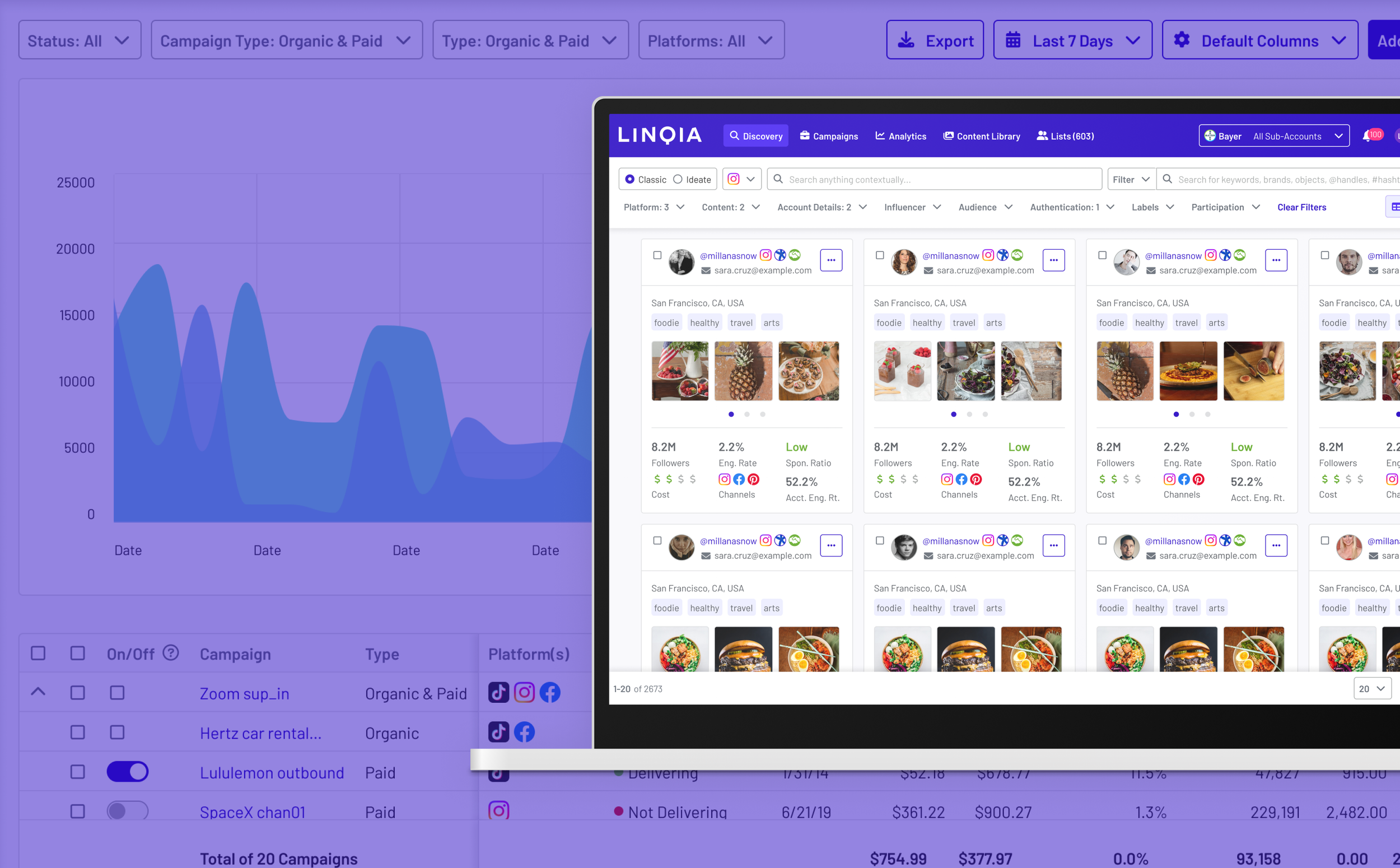
Linqia, Influencer Marketing
Main Objectives & Outcomes
Shortly after joining Linqia in June 2022, as a strategic Lead Designer, one of my first initiatives was overseeing the design team, processes, and files while conducting a thorough UX audit of the existing product. The objective of this work was to spark the next era of the Linqia product and explore potential new revenue streams. This included the possibility of transforming the core product into a self-serve platform and introducing a Paid Media Amplification feature. Research samples: TikTok API: Integration (Sample 1, Sample 2, Sample 3, FigJam Sample 1, FigJam Sample 2)
Even with shifting business priorities concerning new revenue streams, my time can be summarized as follows:
Successfully laid out the framework for the next phase of Linqia, establishing a unified design system.
Proposed to pair down and phase out the overly complex UI/UX, which hindered existing user progress and generated confusion.
Created strategic designs to showcase the vision for the upcoming phase of Linqia's development.
Demonstrated the effectiveness of the proposed changes during the parallel building and release of the Creator/Influencer Payments project.
Laid the foundation for the core Workflow review function of the Linqia product suite.
The Linqia design system significantly enhanced design and engineering velocity
Old Figma Design File
Production CSS File Structure
During the audit, it became evident that the existing Figma files and structure were unusable, leading another designer on the team and me to decide to start from scratch. The lack of clarity and consistency in the design files had hindered effective collaboration between engineering and design in the past. With the knowledge of an impending rebranding as well, I took the lead in facilitating collaboration between the product design and marketing teams to establish new color schemes, typography, and other cross-functional design initiatives.
The Linqia Dashboard had an inconsistent approach to UI and UX resulting in an accumulation of a significant amount of design debt along with hardcoded styling. This resulted in a steep learning curve for users, coupled with hidden features, and unpredictable behavior.
I led a cross-functional team to undertake a complete revision of the existing hardcoded components, leveraging the rebranding company initiative that would eventually enhance the entire end-to-end user experience. As the team leader, I actively incorporated customer feedback, streamlined ongoing work, and guided product releases on the Linqia dashboard. The result was a new design system that would unify and govern the entire product, facilitating seamless feature releases and providing an adaptive and future-friendly component framework for both existing and upcoming products.
Former UI look & feel
Inconsistent form editors
“It works though”
Although the managed heavy white glove service has been exceptionally effective in resolving a wide range of issues, including those previously considered as 'education' issues, there are some underlying UI/UX concerns that would need attention for scaling the product and creating new features, especially with a more junior engineering team.
Linqia required a significant revamp to cater to those who did not know about available workarounds
Addressing the UX issues of the Linqia dashboard was crucial to ensure the effectiveness of marketing and growth efforts throughout the funnel. Additionally, it was essential to enable new users to successfully source and scale Influencer/Creator campaigns. To identify the top priorities for the revisions, we collaborated closely with internal customers and clients who rely on the Dashboard to run their campaigns and identified the following.
-
Address issues in the current unpredictable user flow while laying a solid foundation for more efficient development of additional features.
-
Principles were established to serve as both a design and engineering guide, ensuring continuous alignment and preventing any divergence.
-
While identifying low-hanging fruit for immediate action, it is essential to remain open to pursuing long-term, slow-burn victories through larger projects. The goal is to establish consistent building patterns not only on the frontend but also on the backend, including APIs.
A Design System for Scale and Less Questions
As a design leader, I spearheaded the implementation of a design system based on tokens.
New token based design system fully documented in Figma for handoff.
As a team, we meticulously documented over 50 different shades of blue and more than 200 other colors utilized in the live production environment. During our inspection, we collaborated with the engineering team and discovered that a majority of the components had been hardcoded. Additionally, we encountered over 50 different text styles and a plethora of various radius sizes and drop shadows, contributing to inconsistencies in the environment. Dealing with such a diverse and complex design implementation presented its challenges, requiring us to find effective solutions to ensure better consistency moving forward.
As a result we then meticulously catalog primary and additional color schemes, typography, depth, spacing, and sizing. By incorporating these elements into all our components and features, we ensured consistent and cohesive design across future projects to come. The culmination of our efforts was the successful rebranding of Linqia in late October 2022, where we seamlessly integrated the design system to give the brand a fresh and unified visual identity.
Button Example: Equipped with properties
Inputs Example: Equipped with properties
Vision, Strategy, and Exploration
As a strategic designer, my role encompassed not only auditing the existing platform and identifying issues but also devising a comprehensive vision and strategy to enhance user-friendliness and explore additional business opportunities. This involved integrating 3rd party ad networks like TikTok, META, and Google Ads. One of the key aspects was to demonstrate how the product could evolve into a potential self-serve offering, as discussed during the interview process.
Our objectives could be accomplished by incorporating established design software practices, enabling the Linqia product to compete effectively with other marketing and ad tools. Simultaneously, we must ensure that the product remains intuitive and recognizable to marketers who are accustomed to using those tools.
Campaign editor explorations.
The explorations presented on the right and below were aimed at conveying the vision for the mature Linqia product and showcasing the value of the integrated Linqia Design System. These design iterations were based on internal/external customer feedback and market research, which highlighted the challenges users faced while navigating the existing product. Users heavily relied on documentation and hand-holding to understand the dashboard and its features, as each page/module worked differently and was unpredictable. The presence of hover states and buried features further compounded the usability issues where users would become ultimately lost in their goal of creating a Creator/Influencer campaign.
Creators/Influencers Search Discovery explorations.
Campaign list page explorations.
Sharing these explorations with the entire company was crucial to gain buy-in for our long-term vision of transforming Linqia into an advanced product and engineering led organization, propelling it to the next phase.
An Iterative Approach
Although we desired to iterate on the overall UI and address all identified UX issues to pave the way for the overall design strategy, our small team faced limitations. Nevertheless, we celebrated the successful establishment of design tokens and decided to refactor existing components iteratively based on availability and the features we were building. The Linqia Design framework was deliberately designed for future adaptability. By leveraging layout and UI classification rules, it empowered us to expedite product deployment. This support proved invaluable in enabling us to iterate and deploy new product functions without relying on custom design resources each time. Guided by the framework's rules and principles, we ensured consistent and purposeful changes in the evolution of the dashboard over time.
Payments: Design System in Practice

Creator/Influencer payments are used to compensate Creators & Influencers for their services in posting sponsored Ads on their social media channels, such as Facebook, Instagram, YouTube, or TikTok, as a way to ensure they fulfill their part of the agreement.
It is worth mentioning that the Payments project preceded the rebranding efforts and design token implementation. However, as a team, we later decided to leverage the Payments project as a case study for implementing design tokens and scaling the design system over time.
Through rapid usability testing, we swiftly identified the optimal product direction. As a result, we managed to develop the product within a few weeks, a remarkable achievement compared to the months of engineering work it would have taken otherwise. While we initially explored card-style designs, the combination of the newly established design principles and extensive usability testing led us to adopt a simple table design, as shown below.

Walking the Talk
Before I joined Linqia, Creator/Influencer Payments was already identified as a project to tackle. The former product team had drafted some early ideas, but they were not usable for development. Collaborating with the new product and engineering team, we established the core aspiration goals for the project as follows:
Integrate the manual offline process: Transfer the current manual method, involving Excel, Google Sheets, and email exchanges, for paying Creators & Influencers into the main product.
Automate the review cycle: Implement an automated process for the review cycle to eliminate human errors.
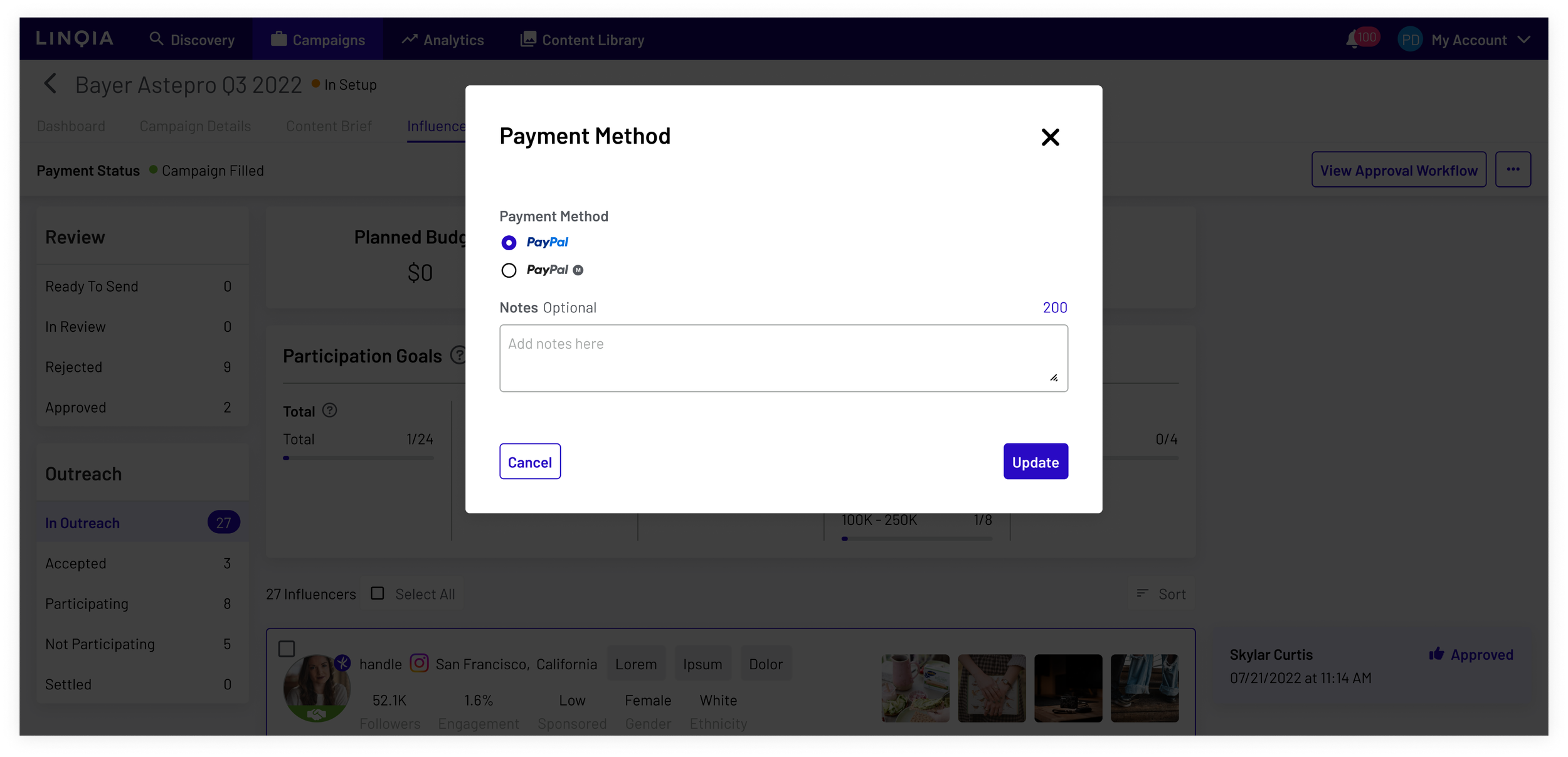
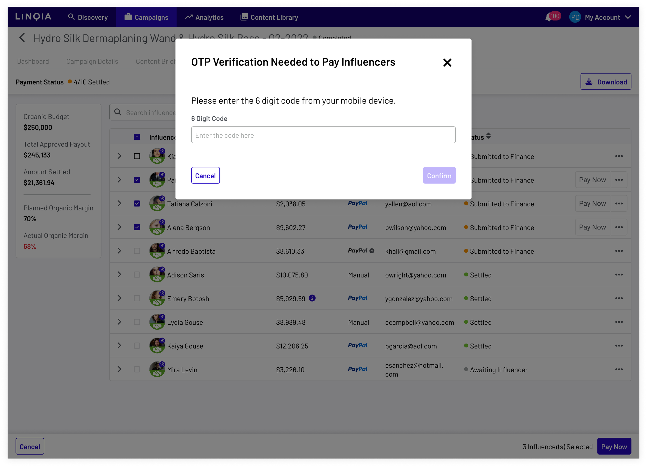
Automate payouts with PayPal API: Utilize the PayPal API to automate payouts, ensuring a seamless process, and trigger notifications of successful payments to all relevant parties, including Creators/Influencers, Linqia Account Managers, Linqia Finance organization, and Linqia executives.
Build out initial data for reporting: Develop a robust data system to track successful and unsuccessful payments, along with any potential payment-related issues, for future reporting and analysis.
The Process
In the early stages, we established personas and general user-flows to facilitate discussions with stakeholders about the distinct actions undertaken by various user groups. Below are the personas listed.
-
Users who are posting sponsored content on their social media profiles on behalf of brands.
-
Internal Account Managers (AMs) are responsible for reviewing and approvals, ensuring the posted content aligns accurately with the initial specifications.
-
Users who would pay out Creators/Influencers after the AMs approved the payout.
-
Users who want to understand campaign performance and margin.
Using the core goals and stakeholder interviews we identified we worked on establishing a core user-flow that mapped out the entire end-to-end process for all personas. Throughout continuous stakeholder interviews, it became evident that the current manual process, involving email exchanges and spreadsheets, was extremely time-consuming. Despite its inefficiency, it was essential to guarantee accurate and timely payments for Creators/Influencers.
Early Concepts
Before the rebranding and implementation of design tokens in the Linqia product, we explored some initial design and UX approaches for the Payments project. One of the significant early questions was whether we should create custom features for each persona or consider an alternative approach. Historically, Linqia had custom views based on personas, even though the same features were accessible to all personas.
Initially, we investigated card-style approaches to organizing data, considering it was a prevalent pattern in the product. At first, we had a view where a Linqia Account Manager could click to reveal and see the content posted by the Creator/Influencer. However, in the end, we transitioned to a more traditional table view design based on feedback cycles, usability testing, and the parallel rebranding design token project.
Feedback Cycles, Usability Testing, and Design Tokens Impact
Account Manager view
After going through several design iterations and collaborating with engineering, we ultimately settled on a straightforward table layout that included the relevant data. The decision to use a table was driven by the recognition that we would most likely require more data over time. Additionally, the card-style approach showed inconsistencies and scalability issues when applied to other areas, leading us to opt for the table design.
Finance User View
Another notable achievement was the successful implementation of the table component and additional components for the new payments page, all of which incorporated new design tokens. Following review cycles, we decided to place the requested content deliverables on the left side via a click to reveal UX, addressing Account Manager feedback requesting a reference to the requested work. On the right side, we developed a service that dynamically pushed all posted content from the Creator/Influencer. Moreover, we established a notification email service to automatically send notifications once a sponsored post was posted by the Creator/Influencer persona, this service also sent notifications to all personas based on payment status changes.
After conducting several rounds of testing to validate our hypothesis regarding moving away from the UX pattern of providing each persona with a different view, we discovered that this approach was unnecessary. Despite some initial resistance, we eventually agreed to change this cultural view. The revised decision ensured that personas would only have different actionable Call-to-Action (CTA) options but still access the same information and payment status.
Additional Requirements & Changes
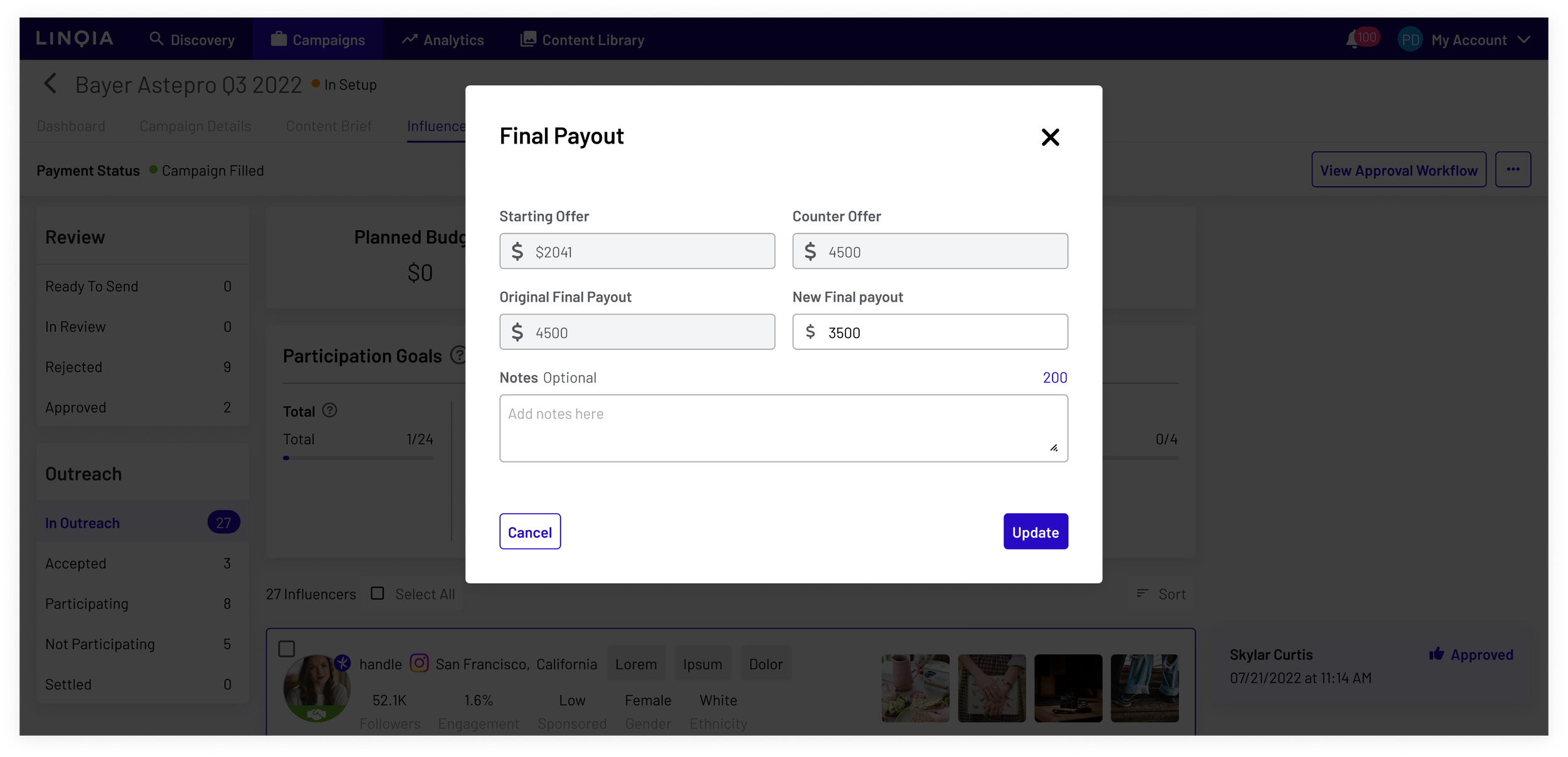
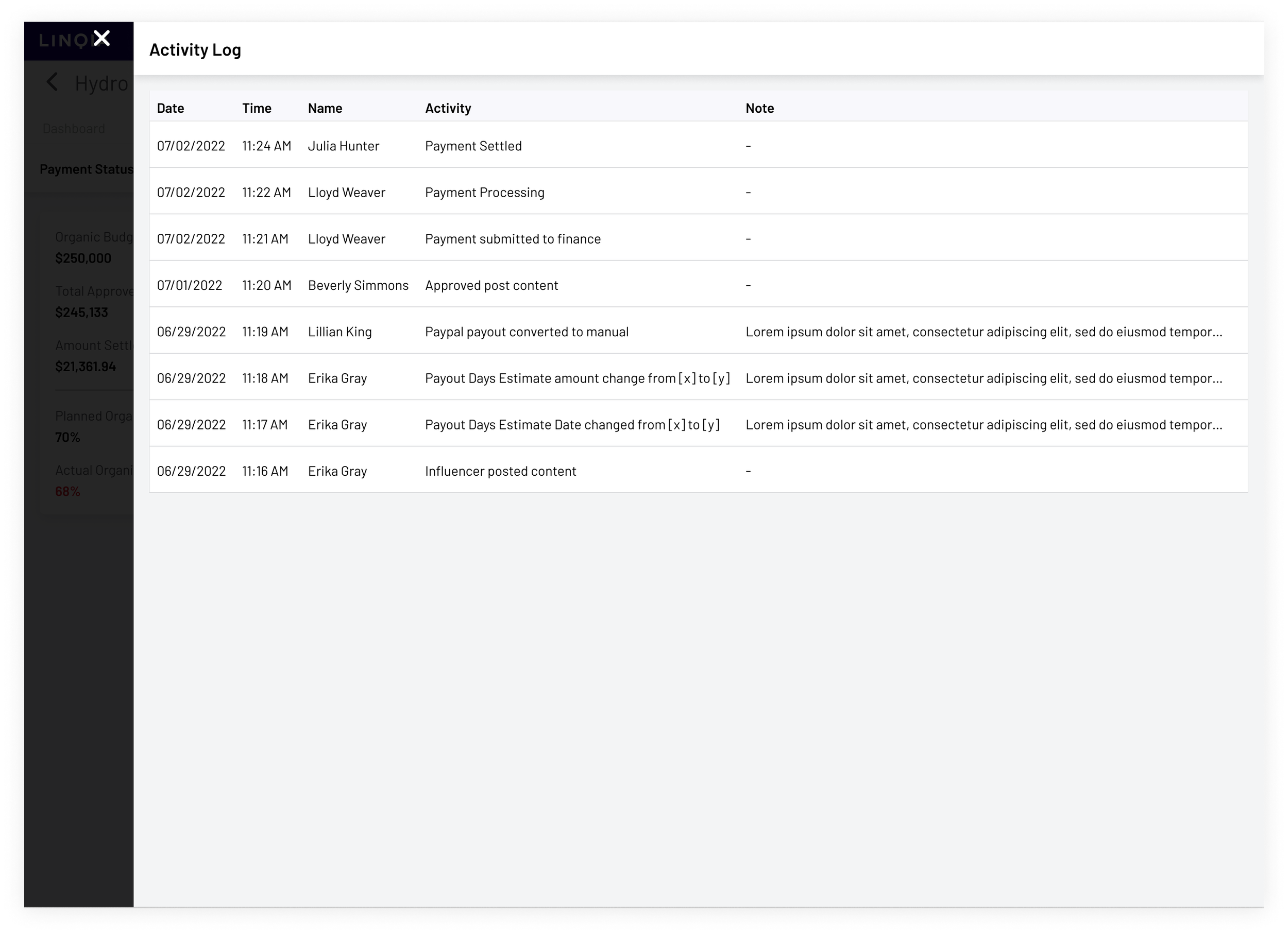
During stakeholder review and usability testing, we identified additional features that were necessary for the product. These included the ability to modify the payment type for manual payouts, adjust the final payout value, enhance security through an OTP (over the phone) service, and introduce an activity log that would record all payment-related modifications for easy auditing purposes.
Key Outcomes
The design system empowered our engineering team to make design decisions without constant design intervention.
These decisions extended beyond state modifications and design token usage to encompass design patterns like search, pagination, and ‘select all’ impact.
We achieved significant development time reduction, from months to just weeks.
After the initial release, we managed to cut an average of 40 hours of work dedicated to paying out Influencers during each campaign cycle.
The chance of errors related to payouts was reduced to 0%.
The payment database efficiently positioned us for future features that could utilize an activity log.
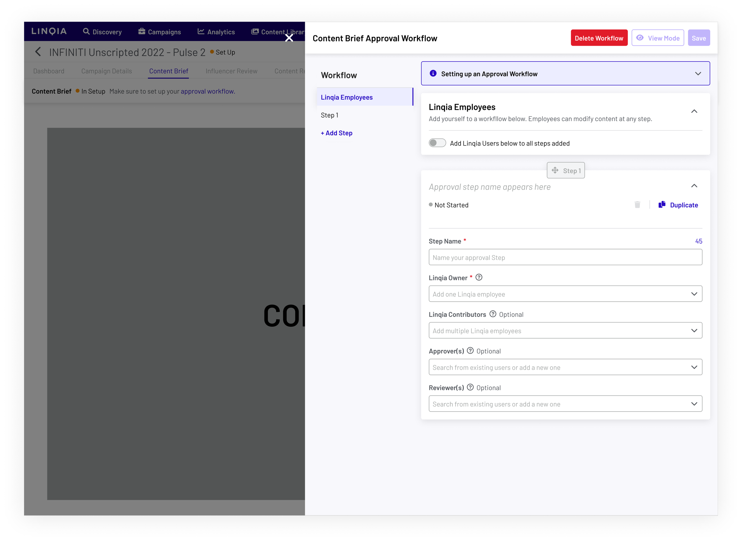
Workflow: Design System in Practice
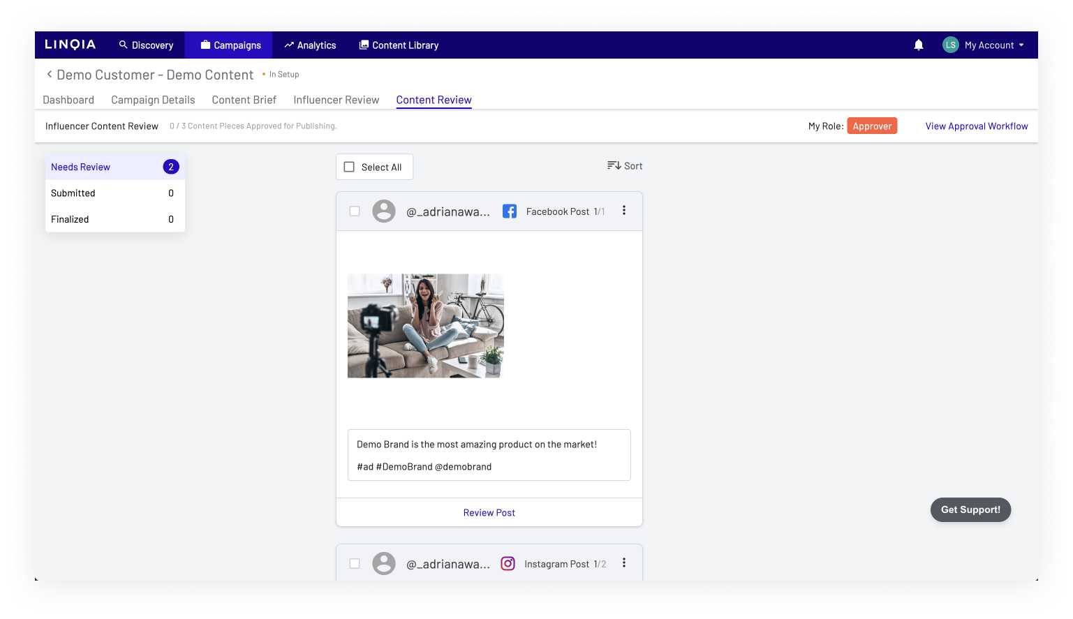
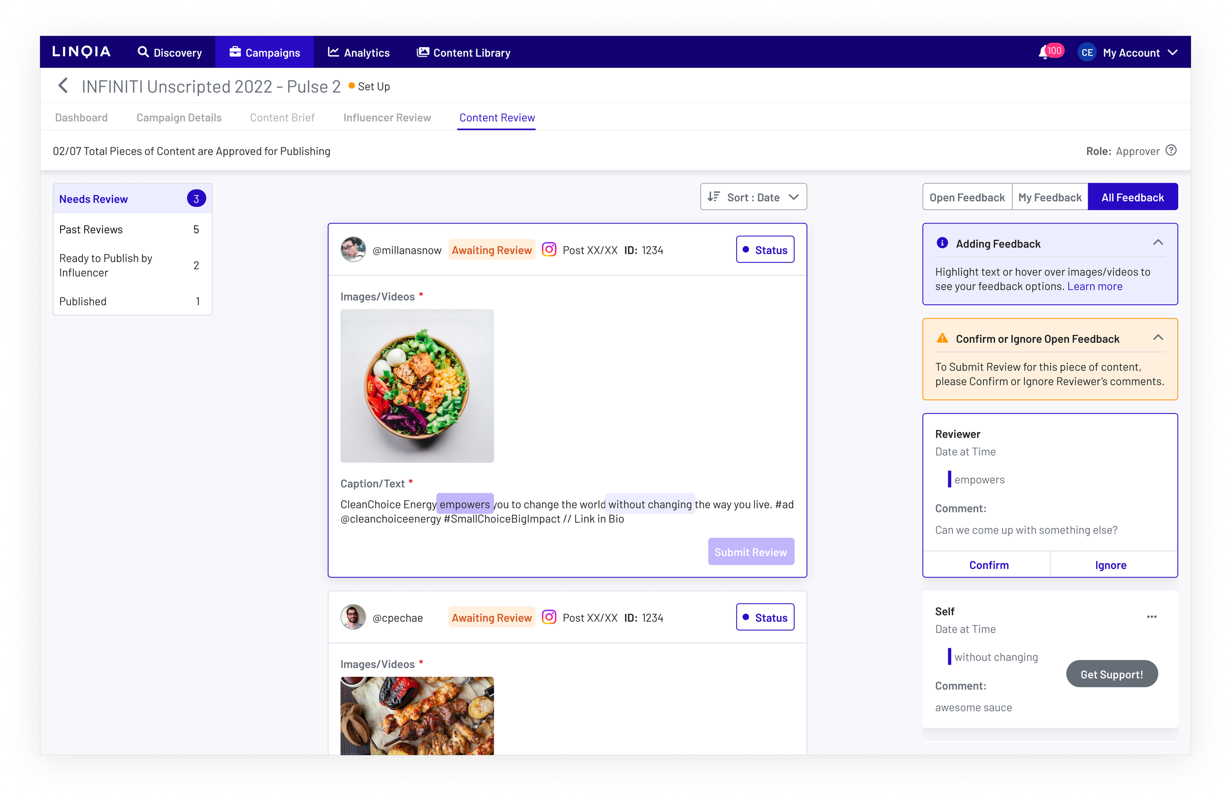
Workflow Review is at the core of the relationship between clients and internal Linqia Account Managers, laying the foundation for their collaboration. It entails a structured process where clients actively review, provide feedback, and request changes to the proposed content before it is published by Creators/Influencers. Additionally, these review cycles would extend across the entire platform, facilitating the evaluation of 'Content Briefs' and the selection of intended Influencers for marketing campaigns.
As the Lead Designer, along with our broader team, we utilized the newly established design system and principles to focus on the primary goals for the Workflow Review project, which are outlined below:
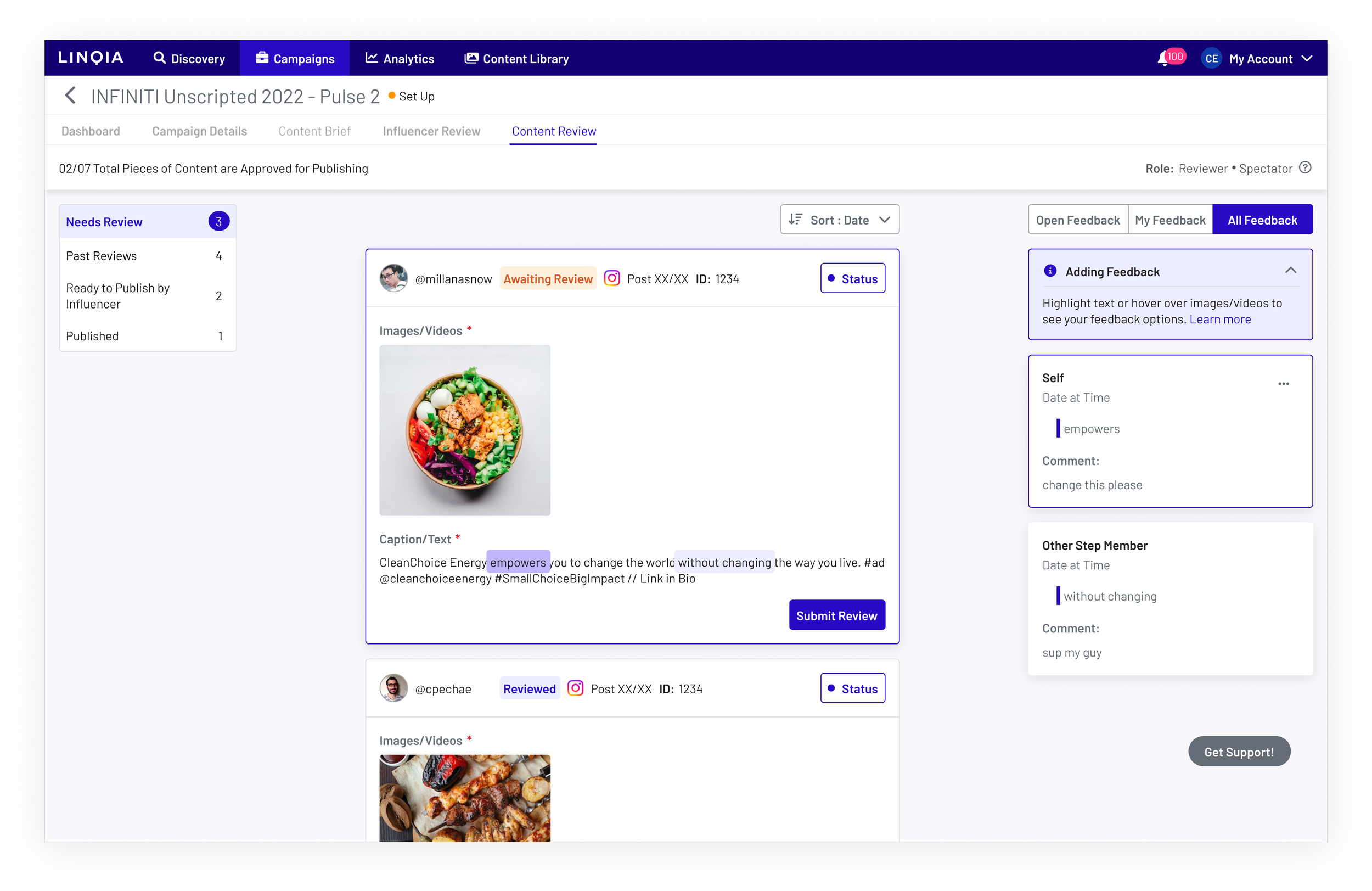
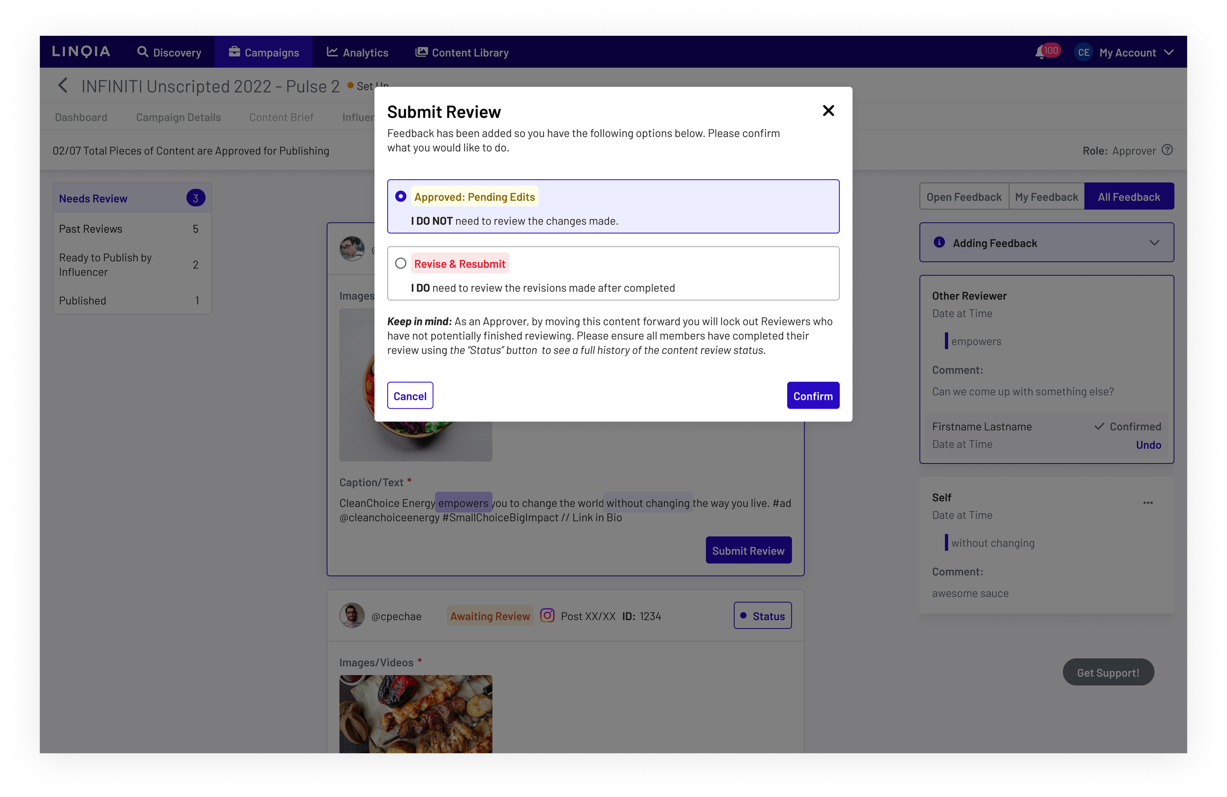
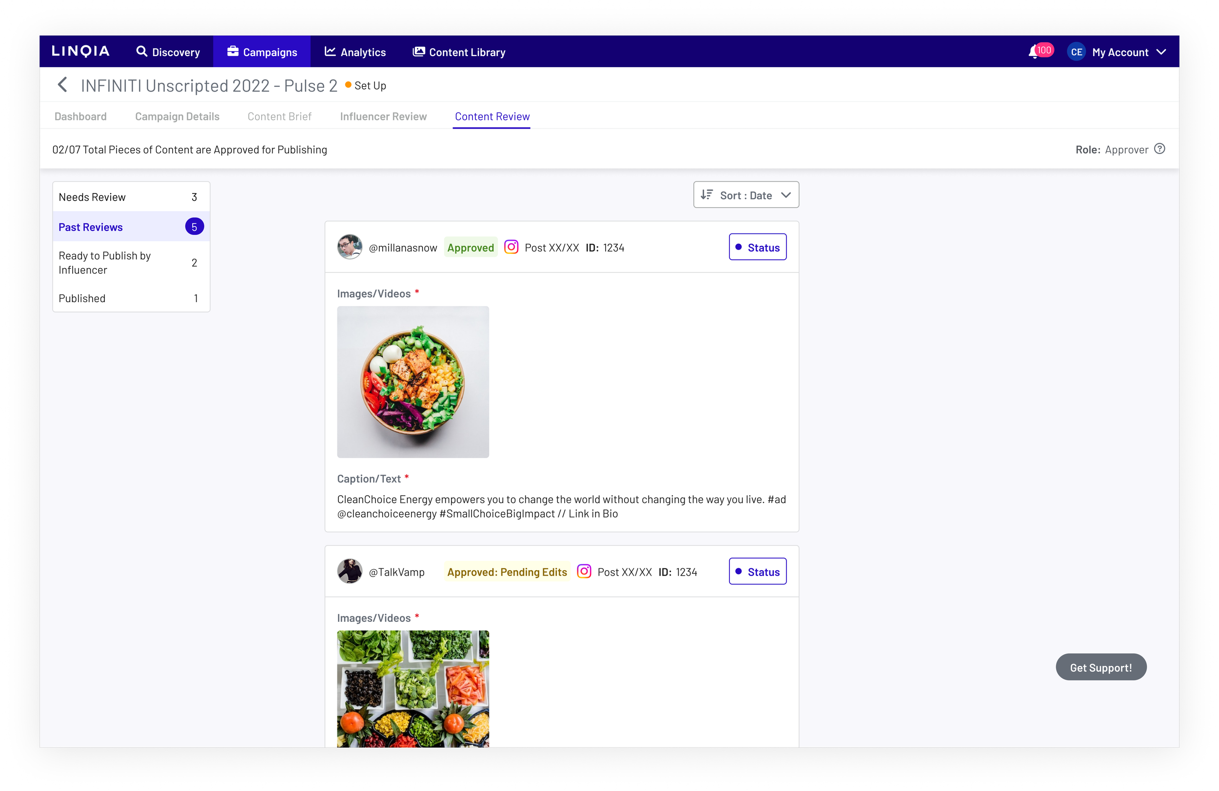
Streamline Content Review for Clients: Enhance the system to allow clients to easily review content by adding comments, providing feedback, and requesting changes effortlessly.
Automate Review Cycle: Implement an automated process for pushing content to be reviewed, replacing the current manual method where Account Managers send emails to prompt clients for feedback.
Flexible Modification of Review Groups/Steps: Provide internal Account Managers with the ability to modify review cycles as needed without causing any disruptions.
Enhance User Experience to Avoid Obstacles: Improve the UX of the current product to prevent users from encountering obstacles that hinder their tasks.
Retain Effective Patterns: Preserve existing patterns that have proven to be successful, as they are not a priority for modification.
The Process
Similar to the Payments project, establishing the different personas impacted was crucial, encompassing not only Clients and Linqia Account Managers but also Creators/Influencers.
-
Users from the brand side, including the legal team and core marketing team, were meant to review the content.
-
Internal Linqia employees are responsible for facilitating the review cycle between all anticipated and unforeseen users.
-
Users who are expected to submit their posts according to the deliverables specified by Clients and Linqia Account Managers.
As a cohesive team, we engaged in extensive whiteboarding sessions to map out user flows and story mapping. This approach allowed us to thoroughly assess potential pitfalls or issues in our intended product based on the requirements. Given the significant business impact and complexity of the product, we relied heavily on whiteboarding. Below are some glimpses of our quick and collaborative backend whiteboarding process, involving individuals from product, engineering, and key business stakeholders, all coming together to promptly identify any potential shortcomings.
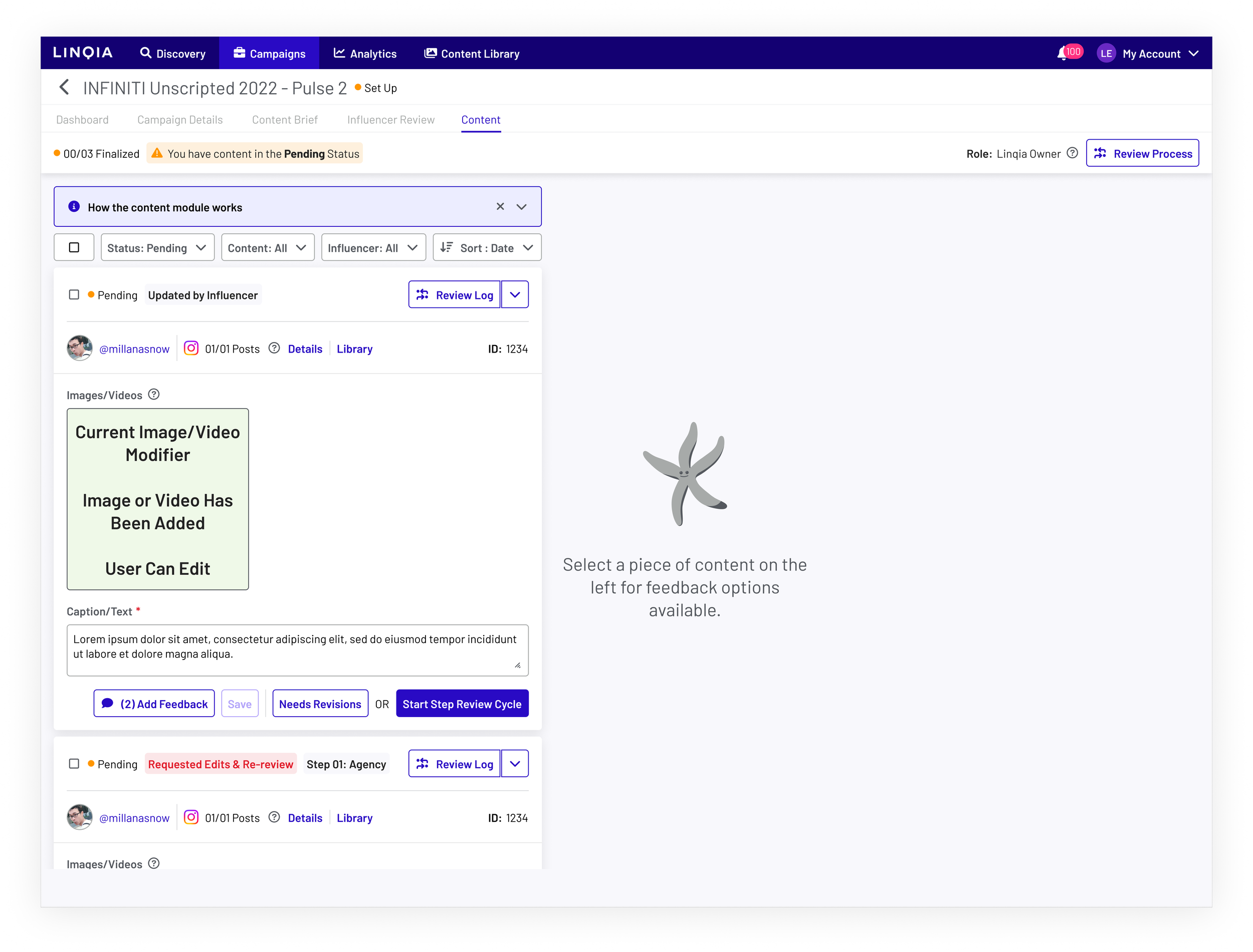
What the feature looked like before
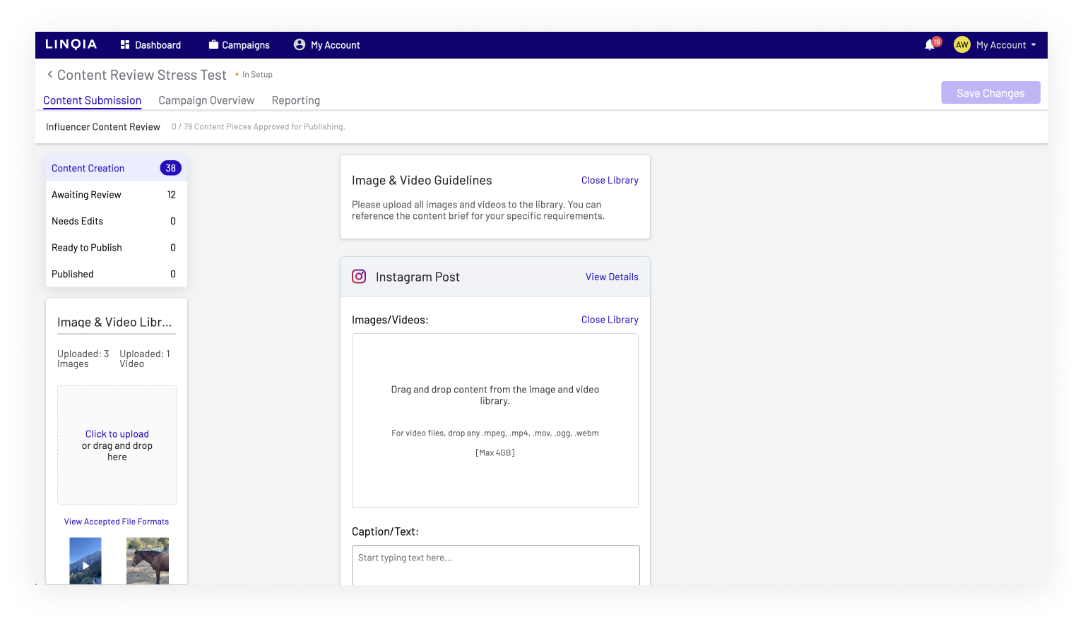
Below are screenshots of the previous page, which was plagued with usability issues discovered during UX research and stakeholder reviews. While we couldn't address all the problems, such as modifying the media asset upload and select function or replacing the folder pattern, we did make some improvements.
Early Concepts, Feedback Cycles & Usability Testing
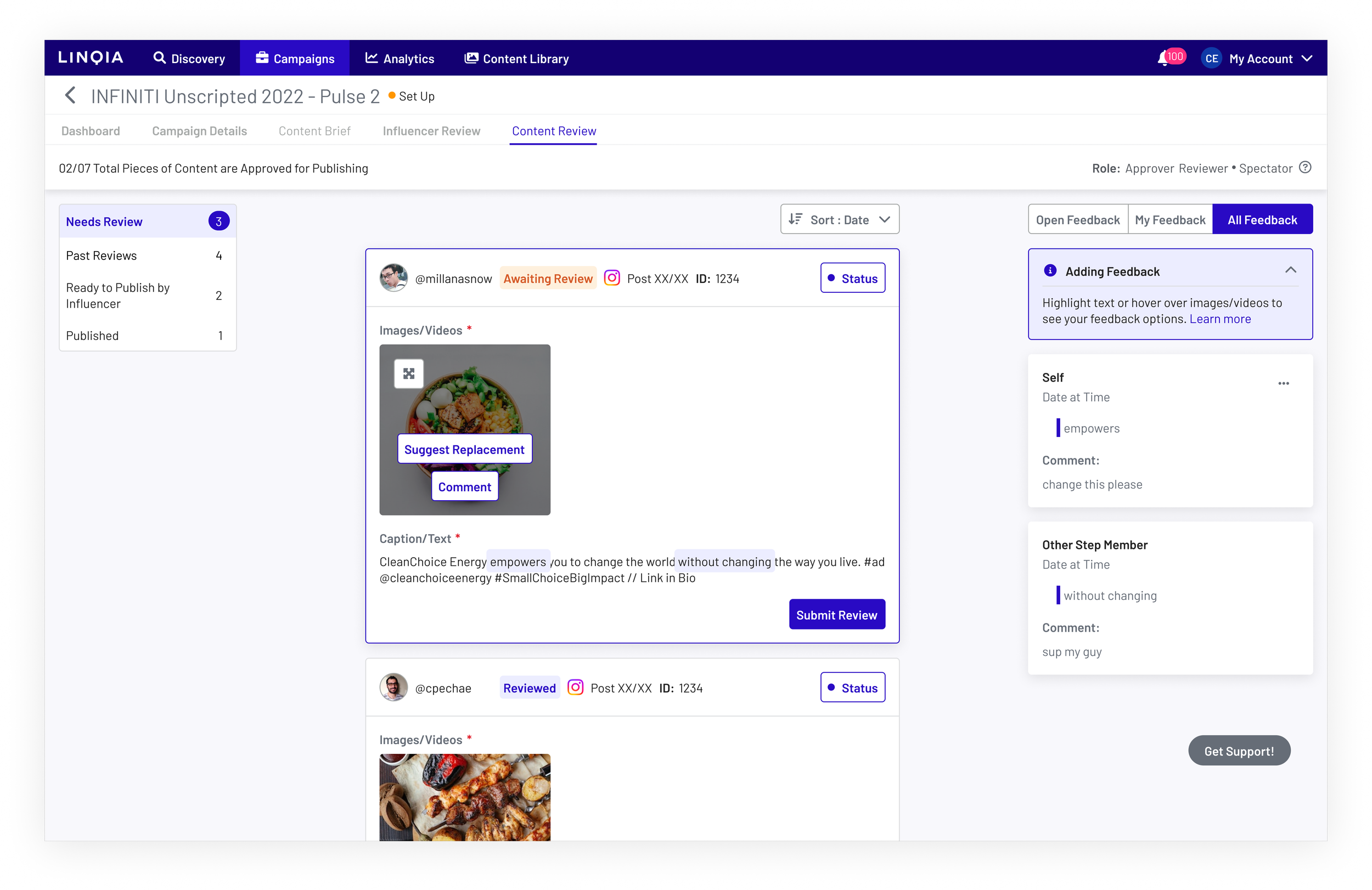
Using the newly established product design system and design principles, I conducted multiple iterations of the Workflow editor and the potential revised Content Review page. Key highlights included introducing a new form editor, which was not previously established, and aligning the end product for personas to avoid building and maintaining the same core feature in multiple ways. We modified the member addition process for reviewing content. Additionally, we added more onboarding indicators to help users understand the product better, based on feedback indicating that the product required significant guidance for ease of use.


Key highlights from the usability tests, conducted using Maze, influenced the final look and feel of the product.
Early designs had the editor and review status table in a separate area to allow users to modify all review cycles for Clients and Linqia at once. However, it was identified as too detached from the module, so we moved it to a side drawer for better integration.
Simplified and standardized the form editor.
Renamed some folders to enhance user-friendliness, considering the potential replacement of folders with real statuses in the future.
Added clear indicators to content cards to inform end-users of the review status.
Transferred hidden features from the context menu of individual cards to the core content card itself for improved visibility and accessibility.
For this initial project, we chose to stick with folders and not make a transition to more traditional status indicators, so as to prevent any expansion of scope that would exceed the consensus we all agreed upon.
Influencer Persona
In the role of an Influencer, individuals are required to upload their media content, which is subsequently assessed by other users who provide feedback.
User has to add their media
User can see the feedback given by stakeholders.
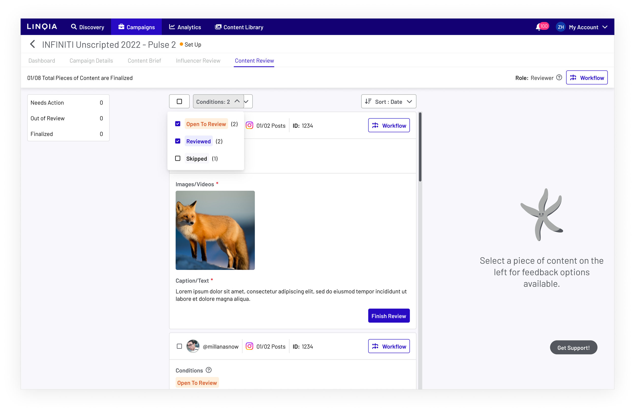
Linqia Account Managers
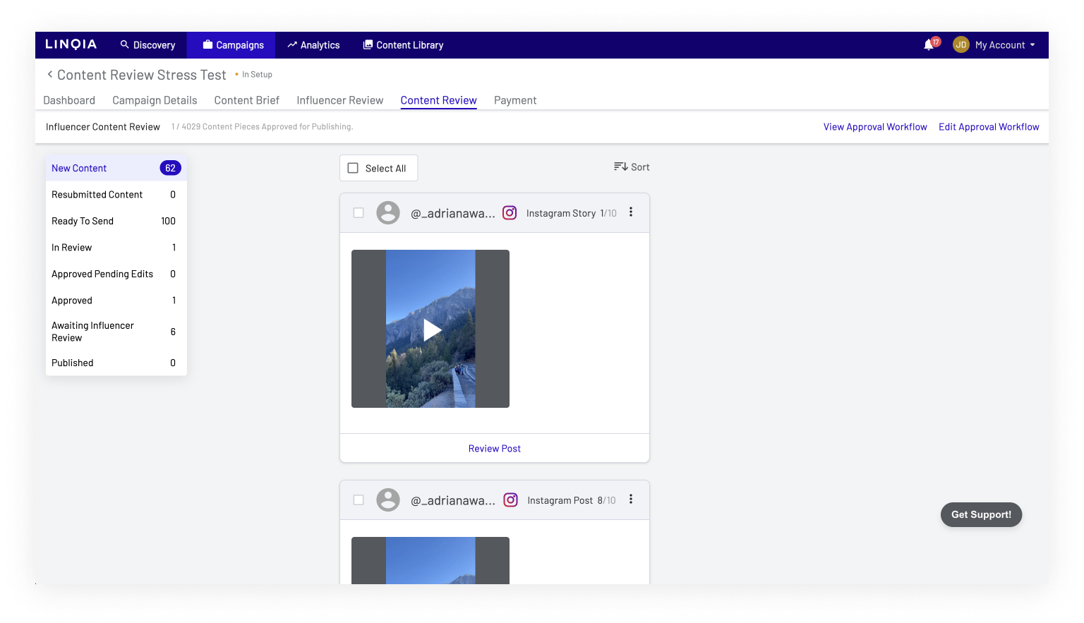
Workflow Opt in option
During the project's initial release, Linqia Account Managers were required to choose to adopt the new workflow. By default, we encouraged users to embrace the New Workflow to showcase its capabilities, while gradually transitioning users to the new product. Over time, we systematically transitioned all users to this new process before ultimately discontinuing the choice.
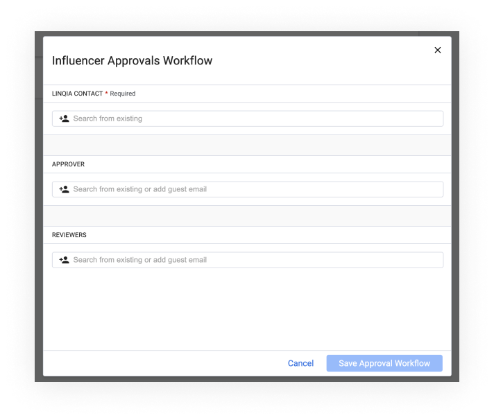
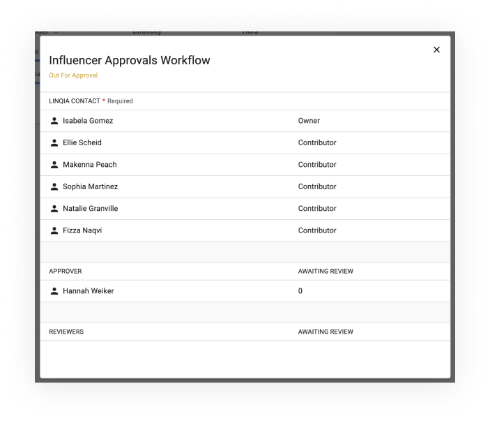
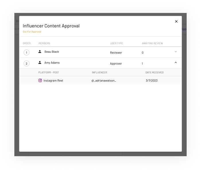
Below, you'll find illustrations of the Workflow editor, designed for Linqia Account Managers. This tool helps them identify the relevant participants in the review cycle both from the internal Linqia perspective and the Client side. Additionally, the review log is presented below to the right, aiding Linqia Account Managers in tracking who has conducted reviews and who is yet to provide feedback.
Workflow Step & Member editor for Linqia Account Managers.
Workflow Review Status
Observe how the new product's appearance and sensation eradicated disparities among user personas. This adjustment ensures that if a change were necessary, it would only require a single modification to a component, unlike the previous scenario where three separate modifications were needed.
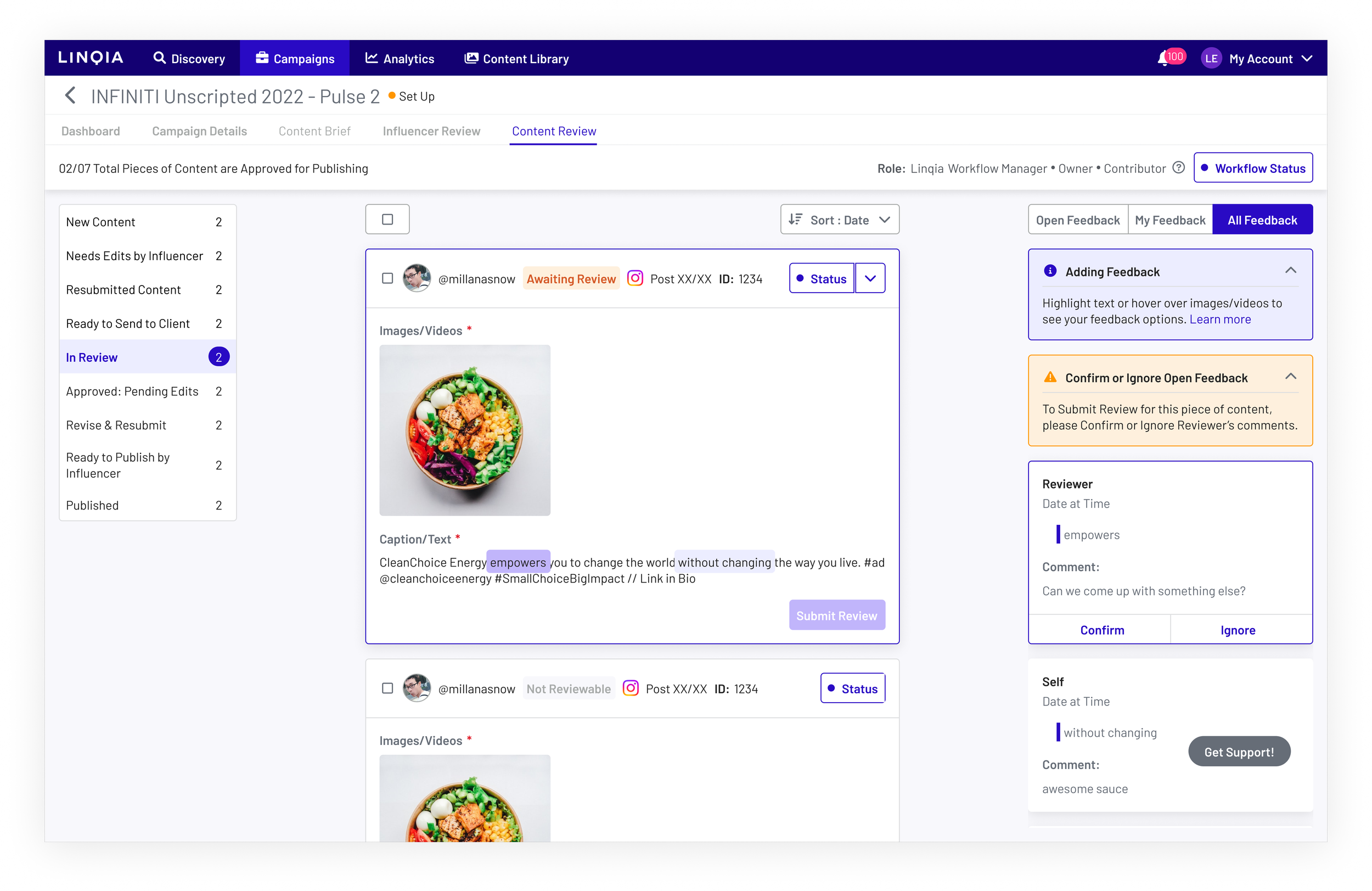
Client Personas
In the role of a Client user, individuals possess the choice to evaluate content shared by Influencers and offer feedback, which will subsequently be utilized to request modifications if needed.
Final Showcase & Key Outcomes
We utilized this product to introduce a new review feature that would eventually be implemented across the entire Linqia product.
As a product and engineering group, we lacked a universal, componentized form editor at that time. However, during this process, we created a universal editor that could be utilized in other enhancements of the Linqia core product. This editor was made responsive and could eventually bring the early explorative designs to life over time, leading to a streamlined UI.
We optimized the review cycles, reducing the average review time from days to just hours.
We enhanced user-friendliness and the Linqia-to-Client relationship by making it easier for users to pick up and understand how to review content.
We enhanced every element of the complete product to ensure its alignment with the new design tokens, and to avoid hardcoded elements, thus eliminating the previously inconsistent user experience.