
Vungle (now Liftoff): Ads Manager - Platform

The Evolution of the Vungle Platform from the older dashboard to design iterations to the final design.
VUNGLE WAS a b2b AD NETWORK PLATFORM THAT ENABLEd APP DEVELOPERS TO MONETIZE AND GROW THEIR USER BASE VIA AD DISPLAY IN MOBILE APPLICATIONS (gaming & brands)
Vungle, originally a mobile ad platform, facilitated app developers in promoting their apps through engaging in-app video ads. These ads appeared while users used other apps, aiming to be unobtrusive and occasionally offering user rewards. Vungle's platform enabled advertisers to craft, manage, and monitor video ad campaigns, targeting specific audiences based on criteria. The objective was to provide high-quality, user-oriented ads that improved both developer revenue and advertiser success.
In 2017, I joined Vungle (now LiftOff), a mobile marketing platform founded in 2011, which focused on driving engaging ads for ad monetization and user acquisition. The Vungle network served ads, utilizing a dashboard to edit, add, and evaluate performance.
Vungle (now Liftoff), Ad Network
Highlights
Joined as the sole designer, a role maintained for several years.
Assigned the task of converting an internal employee-facing UI into an accessible external UI for monetization and user acquisition managers to build a new service and source of revenue.
No Self-Serve product existed, users could sign up but were given a generic email saying that we would reach out.
Prioritized developing the Advertiser Self-Serve UI over the Publisher Self-Serve UI.
The decision to focus on Advertiser UI driven by the goal of achieving a successful BETA release by the Game Developers Conference of 2018.
Successfully met the target of launching the Advertiser Self-Serve UI within the set timeframe.
Initial Request & Team
Prior to my starting, the idea & promise of an Advertiser Self-Serve platform was already an established year-long goal. The team that would create said Advertiser platform was not yet created. As a business Vungle did not have an Advertiser Self-serve Platform.
The initial team, beside myself, was a Product Manager, 1.5 engineers (half of a tech lead & a senior full-stacked engineer), a Program Manager and QA. Although with such a large task and small team the ability to create a completely new UI may have seemed daunting, however, we were all excited as most of the team were all new employees.
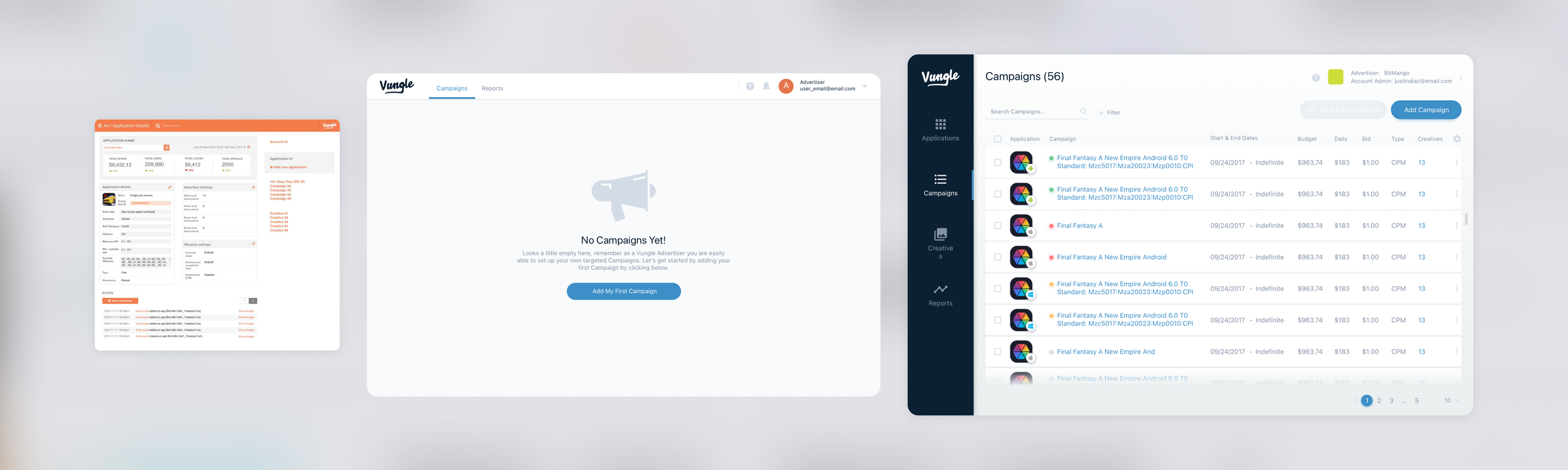
Former Dashboard (2016)
Below is quick glimpse at what the internal dashboard looked like.
Issues:
The UI's appearance was outdated in comparison to contemporary design patterns.
Editing options were confined to internal users, and finding accessible content necessitated extensive internal training.
The codebase was outdated and lacked scalability, as it was based on a bootstrap template rather than React.
UI patterns and workflows were absent, incapable of accommodating scalability, such as paginated tables or customizable table content.
The relationship between apps and other entities, like campaigns and creatives, was only comprehensible within the internal context.
Copying or pasting the UI externally was unfeasible due to the aforementioned limitations.
Understanding the Industry, Business, Tech, and Existing Branding
In order to first understand the request and further identify issues the following research was co-completed by myself and the Product manager at the time.
Competitor Analysis and Review. At the time Snap’s Advertiser Self-Serve platform was being released.
Website at the Time (2016 - March 2019), shows a different style guide from the existing internal UI.
Keywords highlighted from discussions.
Gathering Insights from Various Perspectives
Conducted interviews with both internal and external customers to gain comprehensive feedback.
We were turning away business due to lack of a Self-Serve experience.
Utilized a hands-on approach (via shadowing) by sitting beside and observing internal sales team members
Brainstorming workshops and user interviews were conducted to understand their daily experiences, pain points, and workarounds where users had to go outside of the core product experience to conduct an action.
Focused on key identifiers highlighted by users, enabling a deep understanding of the existing internal product.
External products were used that would not be readily accessible to a Self-Serve user.
Business Hierarchy Visualization: Created a comprehensive mapping of the business hierarchy to identify essential design requirements for potential pages.
User Story
As a user acquisition manager, I would like to add a new app or reuse an existing app to add/edit campaigns/creatives that would serve on the Vungle Network. I would like to report on them as well to understand the performance of campaigns & creative ads.
PRD co-written by Product Management & Product Design.
Documentation co-written to support the Product.

New vs Old Workflow
Establishing the Initial Style Guide & Design System (Sketch)
Content regarding the style guide below defines primary colors, fonts, and core components to create a new UI.
Thinking back, the usage of a tool like Zeplin would have been ideal, however, for this scenario, we committed everything to Sketch, in later projects I used Sketch + Zeplin for communicating key designs.
Vungle design system v0
Vungle design system v1
Trial & Error
I worked on sketches and wireframes for general layouts that were done via whiteboarding sessions with stakeholders.
Given the time limit on getting a BETA product out within less than a year and in order to keep internal and external stakeholders (new and existing partners) excited along with executives, I worked on a series of iterations on hypothetically what the new UI could look like. A series of still images along with InVision prototypes were created and distributed for client feedback. While some more North Star designs were made and viewed, I worked with the Product Manager & Engineering team to refine requirements and illustrate the overall design patterns plus user journey based on feedback.


Feedback Sessions Impact
We ran AB testing and additional usability exercises with internal and external clients with the above designs. Via the sessions, we identified that the navigation would need to be shifted to a vertical approach due to the additional pages we wanted to add. This testing phase enabled us to further synthesize the look/feel of the product experience and highlight several key needs for what we intended to eventually deliver as an MVP <> BETA product.
Below depicts a more simplistic state of the product that we were pushing towards, these included a Home page (for new and existing user onboarding, Campaigns and Creative List pages, along with a Reporting page. The major shifts we made were consolidating the main Campaign workflow into simple steps (add app, bidding, targeting parameters, and add a creative) vs the more comprehensive approach. Other key pages we identified that we needed were a billing page so Self-Serve users could pay us and view invoices, as well as a members area.


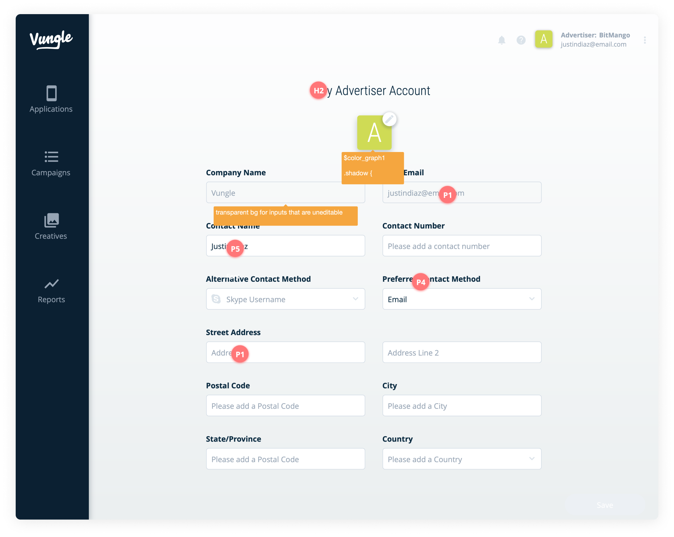
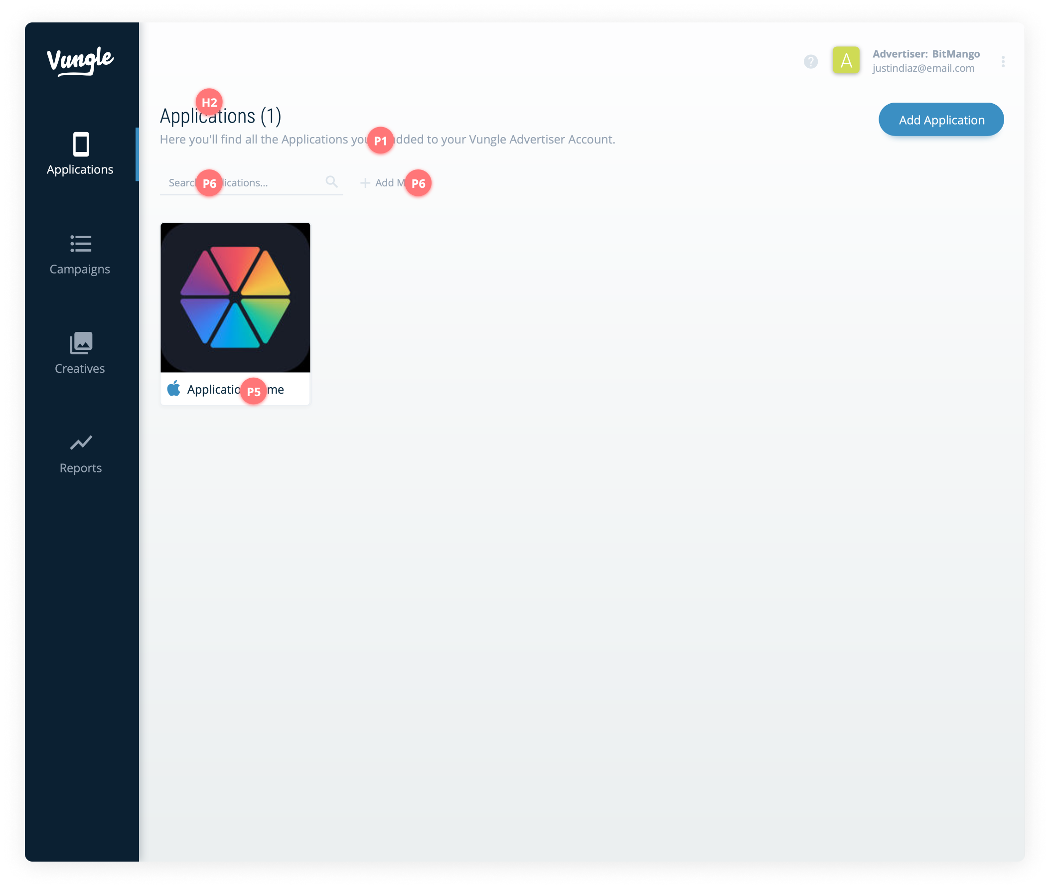
Handoff: Self-Serve & Some Unexpected Needs
Handoff at the time was a bit manual and was completed via a defined style guide with identified design tokens. During this phase, we also decided to pair the UI down to a couple of core features. The ability to add a new app, add a small select amount of creatives, and identify some targeting options along with bids.


Simplified Final Workflow (design revision v56~) : Login > Add/View Apps > Add/Edit Campaigns > Add a Creative or reuse existing one > Understand Performance


The following points showcase the designs that were ultimately developed and annotated to provide engineers with a clear outline of the streamlined process for tasks such as logging in, adding an App, creating campaigns with targeting parameters, incorporating creative ads, and assessing performance. The annotated images below exemplify my hands-on approach and collaboration with stakeholders, as the designs progressively evolved before the BETA release. These design refinements primarily focused on cosmetic and CSS-related improvements.


Emails & the birth of an Admin Console (Backstage)
During the build-out of the UI, as we were pretty quick with defining new needs from the business it was noted that we had to add a series of emails that would be triggered by user action.
Also, we had to create an Admin console to review created apps, campaigns, and creatives added to the Vungle network to ensure that newly created content would not damage network performance. This Admin console grew overtime to accommodate feature flagging and integration with other “frenemy” companies such as DSPs.
Release & What Happened Next?
After hitting the timed goal of a closed BETA rerelease, we made iterations and improved the UI some more based on feedback until we finally GA the product later in 2018 to a larger selected audience.

In 2018 we released a BETA of the UI, and soon went GA after some modifications months later.
Outcomes
-
• Total accounts registered within the first month of BETA release: 75
• Percentage increase in active users from BETA to GA release: 70%
-
• Average number of campaigns created per user: 3
• Percentage increase in campaigns created per user after product release: 45%
• Time saved per user in creating and managing campaigns: 25%
-
• Average number of creatives associated with each campaign: 2.5
• Percentage increase in creative diversity used in campaigns after new UI: 60%
• Number of user-generated creatives added per month: 1,200
-
• Average monthly revenue growth per app using the Self-Serve platform: 18%
• Number of apps integrated into the Vungle network through the Self-Serve platform: 100+
-
• User satisfaction score based on post-interaction surveys: 4.5/5
• Percentage of users who found the new UI more intuitive than the previous version: 90%
-
• Number of support tickets related to UI issues within the first month of GA release: 45
• Percentage decrease in user-reported confusion after UI update: 75%
• Percentage decrease in onboarding time for new users: 40%
Enhancements Beyond BETA release
Below are additional iterative features we added overtime to the product experience. Keep in mind, we rebranded so the color guides were adjusted to accommodate the rebranding.
Self-Serve Enhancements: Overtime we added additional features and further refined the UI/UX of the platform to simplify the campaign and creative editor experience.
Advanced Targeting: Option for users to target device models.
Multi-bidding: Multi-Bidding & precise targeting feature to modify single elements at scale.
Creative Manager Improvements: Automated ad validation feature for scaled reviews. Refer to case study here.
Admin Console: The Admin console was initially created to review accounts, campaigns, and creatives of Ads Manager users. Overtime we committed the product to be Self-Serve parity plus, where every feature included in the Self-Serve product was first tested in the Admin console and additional tools were added to the Admin console such as global permissions & limitations as depicted below.


