
Vungle (now Liftoff): Ads Manager - Iterations - Reports, Campaigns, & Creative List

VUNGLE WAS A B2B AD NETWORK PLATFORM THAT ENABLED APP DEVELOPERS TO MONETIZE AND GROW THEIR USER BASE VIA AD DISPLAY IN MOBILE APPLICATIONS (GAMING & BRAND)
Vungle was a mobile ad platform helping app developers promote their apps through in-app ads. It enabled developers to earn from their apps by adding video ads that showed up while users used other apps, designed to be engaging and unobtrusive, sometimes with user rewards. Vungle's platform let advertisers create, manage, and track video ad campaigns, reaching specific audiences based on criteria. Their goal was quality user-oriented ads, enhancing experience and revenue for developers and advertisers.
Vungle (now Liftoff), Ad Network
MAIN OBJECTIVES & Highlights
From its initial launch in 2018, the Advertiser Self-Serve Platform witnessed limited UI iterations primarily centered around business and feature requirements, influenced by resource limitations. However, a shift occurred in early 2021, and below is a summary of the highlights.
Historical Feedback Utilization & Comprehensive Data Collection
Excerpts from historical feedback effectively capture the Advertiser Self-Serve UI's lifecycle, providing insights for improvement.
The historical feedback includes valuable input from users through in-UI interactions, client surveys, FullStory sessions, and UI/UX enhancements.
Adapting to Multiple Changes
Throughout the product’s life cycle, the Advertiser Self-Serve UI encountered shifts under six different Product Managers.
Despite lacking a dedicated PM during a particular revision phase, a proactive collaboration between a junior Product Designer and myself addressed the challenge effectively.
Scale-oriented New Components:
Developed new components to accommodate scaling needs and enhance functionality.
Integration of these components aimed at optimizing performance and user experience.
These additions laid the foundation for future scalability and growth of the platform.
Personas
-
Responsible for planning and executing campaigns to attract new users for a mobile app. They work with different teams to develop strategies, analyze data, and optimize campaigns for cost-effective user growth.
-
Serves as a primary point of contact between Vungle, a mobile marketing platform, and its advertising clients. They manage client relationships, provide guidance on campaign strategies, offer insights into ad performance, address client concerns, and ensure that clients achieve their advertising goals using the Vungle platform.
Feedback Cycles & Former Pages
Prior to initiating these changes, a series of internal and external feedback cycles were executed to comprehend user pain points and establish critical revisions. The following showcases select excerpts from historical feedback, providing a glimpse into the evolution of the Advertiser Self-Serve UI over its lifecycle. It's worth highlighting that this historical feedback stems from direct input via in-UI interactions, client surveys, FullStory sessions, and overarching UI/UX enhancements.
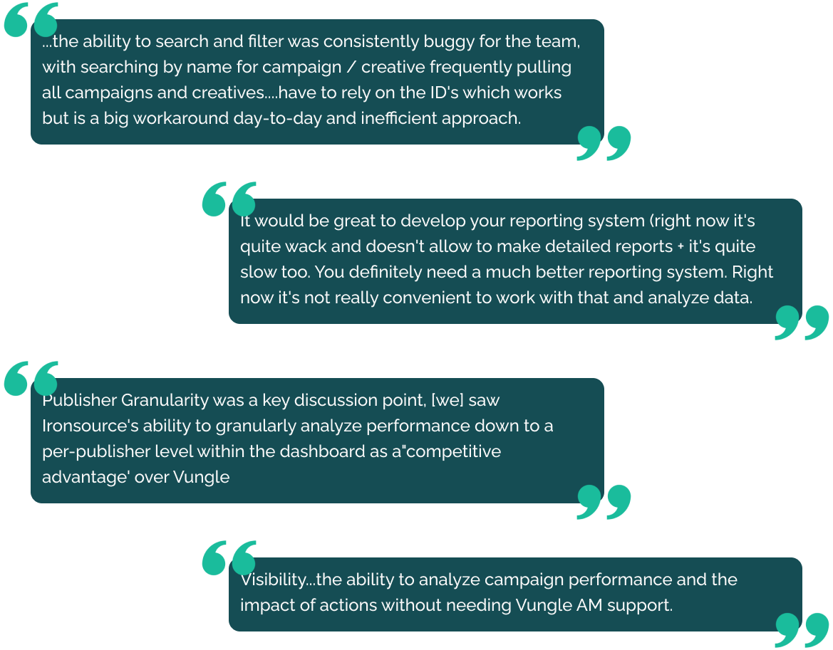

Workflow Enhancement: Users need streamlined unit management, including searching, attaching, and pausing Campaigns & Creatives.
Performance Insights: Desire for concept-level performance evaluation and visibility into active creatives and what assets made up a single Creative.
Efficiency & Reporting: Users seek improved workflows, customizable reports, and enhanced metrics to understand performances.
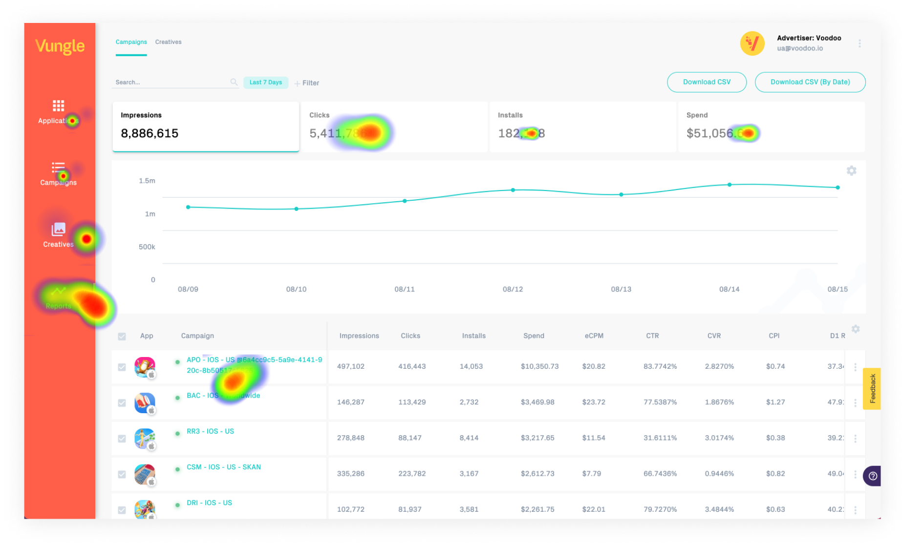
Competitive Research
We were fortunate enough to gather competitive insights from clients, and these were the key highlights from video evidence of usage.
Things just worked as expected, there were no surprises and the pages were not slow.
Users had more controls on the highest level to view performance and available actions to perform.
Performance data & attributes were merged.
Custom reporting was available with granular features.
Super helpful when it came to exploration on the design side.
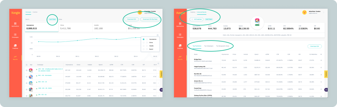
Former Pages: Reports, Campaigns List, Creative List
Reports Page
The previous reports page displayed a pre-filtered view with limited filters and data. It was challenging to use, and the data couldn't be effectively filtered.
Former Campaigns List
Former Creative List
Technical feedback
Via screenshots & Google sheets, we identified the general requirements together as needing a new API, and additional services, such as a new export function and new widgets.
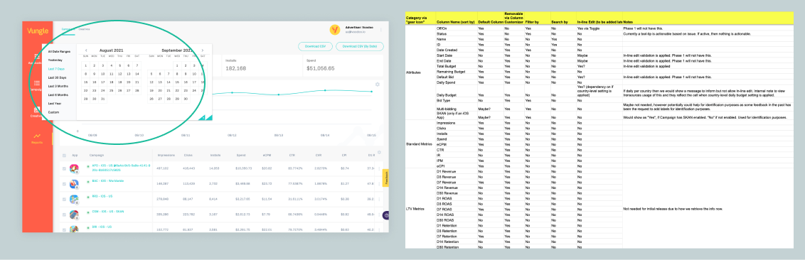
Attribute & performance data pulled from different resources.
Artificial capping of data.
No sorting & filtering.
Calculations on frontend.
Calendar widget was 3rd party and had issues.
Chart library had issues supporting the data infrastructure
Export service was inconsistent
UX Audit
We encountered various challenges with the three primary pages, but we (myself and the other designer) decided to give design priority to the Reporting page based on the considerable amount of negative feedback. Although we prioritized the Reports page, I still worked on concepts for the other pages.
Initial Project Challenges & Buy-in
Project approval had not been obtained at that point. I collaborated with the executive team to secure additional resources (contractors -6 months) necessary to build the new initiatives.
The following key points were emphasized using the top 20 accounts (ranked by ad spend) from the previous year, which consistently generated significant weekly revenue:
Accounts in this group had an NPS score of (-10), in stark contrast to the monetization side of the business which scored 71.
Users expressed a desire for increased transparency and more detailed information.
Among users who historically utilized the Ads Manager product, there was a drop-off of 22%, accompanied by requests for data from their internal account manager.
A noticeable increase in email correspondence through customer service, specifically regarding product-related issues, was observed (15% rise).
This highlighted a clear failure of the Self-Serve Ads Manager, resulting in a significant decrease in user actions and engagement.
The problematic pages showed instances of error clicks and dead clicks. Approximately 24% of the actions performed were affected by these issues.
Trust in the products we were developing was diminishing among Account Managers associated with these accounts.
The most compelling evidence for these observations was derived from the account names themselves, along with direct feedback from clients.
Key Areas of Improvement
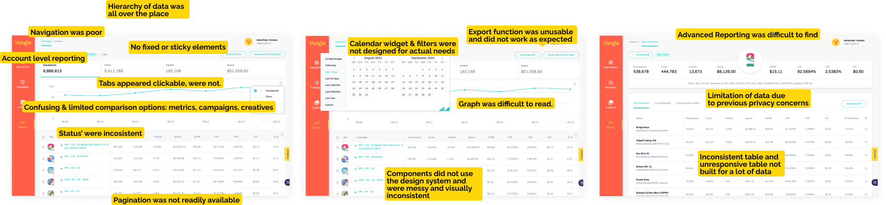
Navigation & visual hierarchy of elements
Was split up into multiple sections and subsections that hid data.Component Inconsistency
The former design guidelines were not used via this page.Saving Issues/Caching was needed for filtering data on refresh
Users were expecting filters to save on navigating from page to page.Need a new chart library due to performance issues
Apex chartsNeed for a complex table to allow sorting, filtering, responsiveness
Export service and UX attributed to this service.
Status refinement and transparency
Every object had a status and we didn’t effectively communicate to users what attributed to said status.
Missing Features
Derived from direct client user research and competitive insights. Putting my Product Management hat on for this. It is Important to note, some of these features were isolated and pushed into the backlog to be picked up later. We still wanted set the product for eventually adding these features overtime to Reporting.
-
• More complex reporting system • Full customization • Saving a report for later retrieval, Cached report instead • Sharing a report • Quick status change • In-line editing of campaign and creative values. • Options to change status’ or quickly add a Publisher to a Campaign. • Asset-level reporting • Additional Metrics (Win Rate of a campaign or creative. | Demographic data Device-level or OS-level info | Platform | Including additional metrics that may come over time. | Essentially a new Reporting API
Sketches & Wireframes
Digital sketch (I tend to use pen & paper now) regarding navigation as well as look & feel of filters & calendar widgets. Positioning of components and how they would work. Ideas beyond just the reports page.


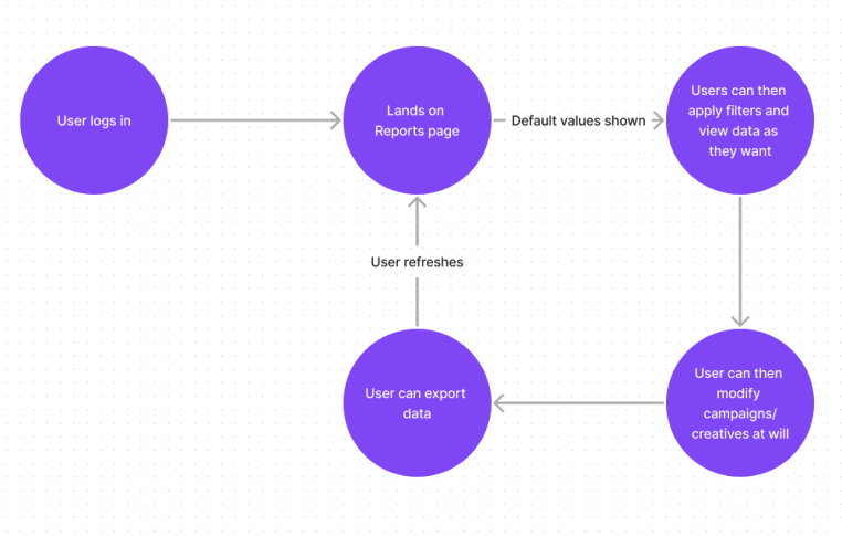
Userflow & Concepts
Early user-flow for communicating the reports page to contractors.
Early concepts for the project. Concepts were used to communicate general layout and structure to stakeholders (engineering & clients). Concepts used to identify key components and features for planning purposes.
Although we had identified that we would hyper-focus on reports as a design team, I also created additional concepts to provide guidance to the wider team about the direction of the product. Design can influence later features, in this case, it was interactions like truncating text, tooltips, movable columns, horizontal scrolling and bulk options.

Scoping, Phasing, & Strategic Building
After much thought, we opted to split the enhancements into phases defined as follows:
Phase 1: Reports Overhaul
Phase 2: New Campaigns List
Phase 3: New Creatives List
Phase X: Backlog, Additional Features, Nice to Haves, & Longterm Revisions
Phase 1 New: Reports Page
During a period without a dedicated Product Manager, a fellow junior designer and I collaborated to rectify UI/UX and other concerns. We introduced significant design improvements, including new components such as filters and a revamped table structure integrated into the repository. The various states and components added are outlined below. Through this effort, we achieved the overarching objective of incorporating new components and data that hadn't been accessible before.
We laid the groundwork for scalability by employing a backend API, which facilitated the creation of scalable and highly adaptable Reporting pages. This approach streamlined metric addition through a plug-and-play backend API, leading to a reduction of over 50% in time and cost whenever new metrics were introduced.
Usability Testing
Internal and Client testing was conducted via Maze software, Mostly positive regarding the proposed changes to the Reports page. We explained the inability to do everything that had originally been requested but hit on the key elements we were adding with this revision. Used testing to define actual default metrics to show in the tables and graphs. AB testing about the navigation changes and placement of CTAs
Final Look & Feel
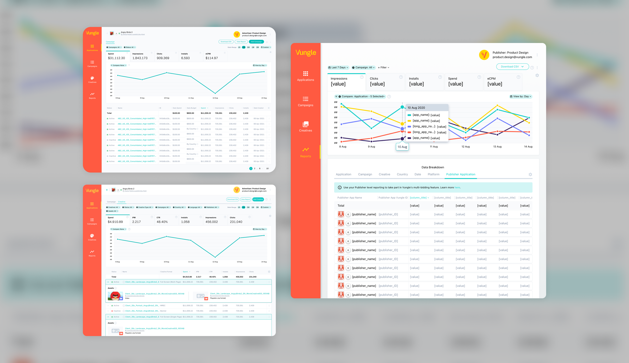
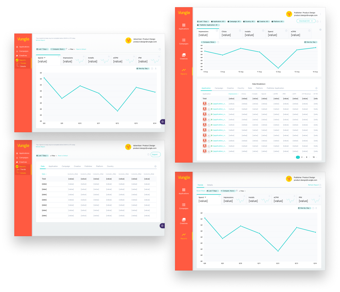
Below are all the intricate instances designed for the final Reports page. Opted to go with a UI similar to competitors in structure, The general layout consisted of filters, then a set of tabs with data metrics, a graph, and a table. Minimized the graph due to the average screen size of our users. Removed trend line in tabs. The new user flow was: User logs in -> Reports Publisher Tab. We tabbed the table due to performance issues with loading up to 6 months worth of data.
Close up views of the New Reports page equipped with a new graph and table structure.
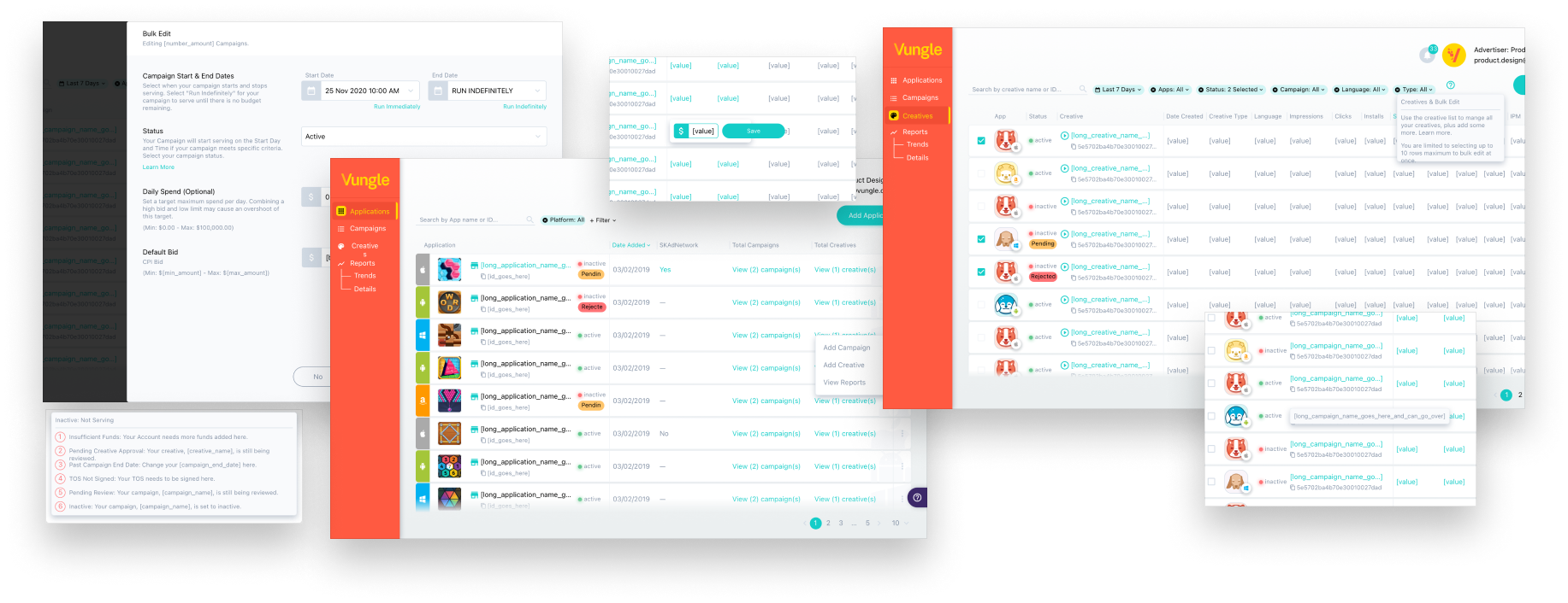
Phase 2 - New: Campaigns List
Following the development of the Reports page mentioned earlier, we leveraged the newly created components to take a similar approach when enhancing the Campaign List. Rather than replacing the former Campaigns page, we opted to add a new “Campaigns” page into a new subsection of the “Applications” page. The former “Campaigns” and “Creatives” pages were intended to be phased out in a later phase, post new “Creatives” list page.
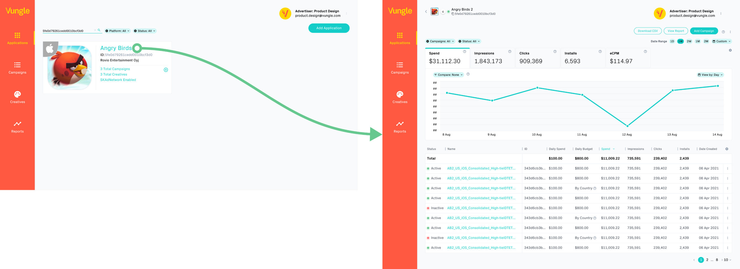
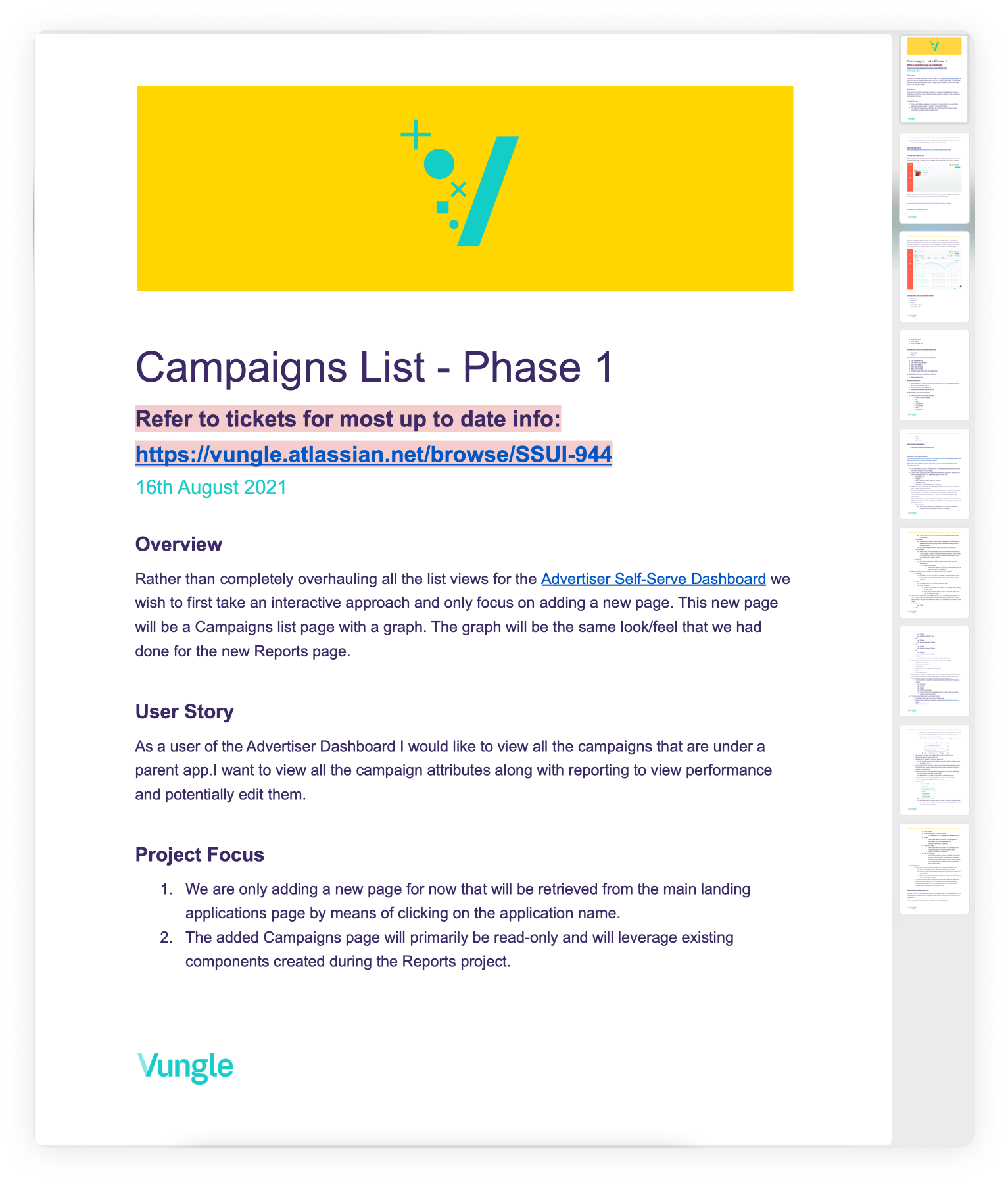
PRD written by myself emphasizing phase 1 of the new Campaigns list that would bring data + attributes together.
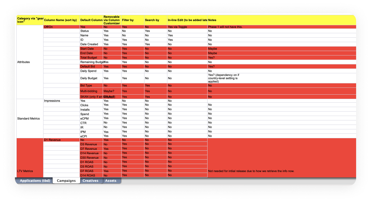
Sheet referencing sortable, filterable, searchable, default and removable columns in the Campaigns list data table.
Phase 3 - New: Creative List
The new Creative list had similar requirements to the Campaigns list, but with the distinction that Creatives required a visual element. This visual element was incorporated through an accordion view that showcases the Assets (Images, videos, and/or Playables) associated with each Creative.
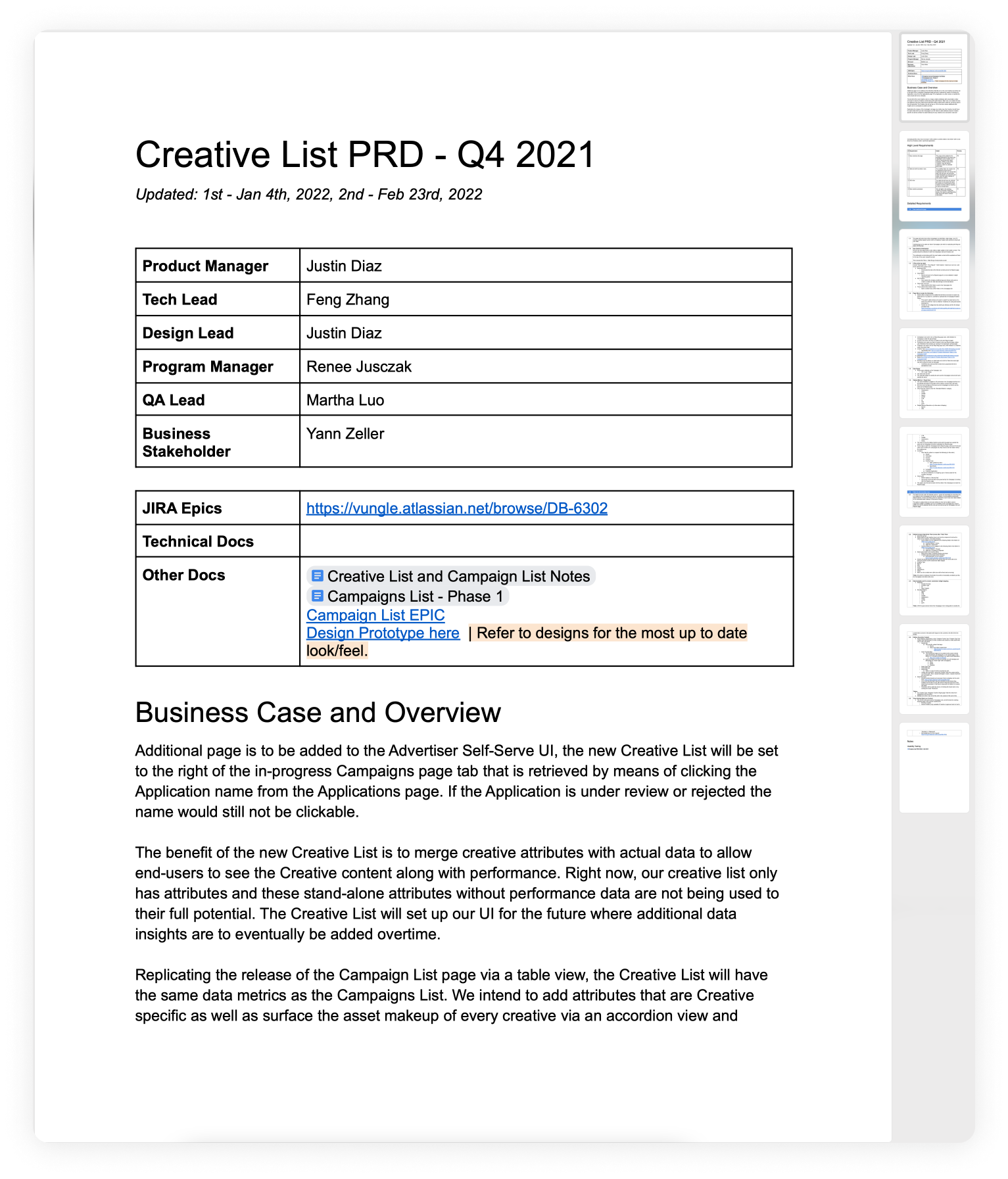
PRD written by myself emphasizing phase 1 of the new Creative list that would bring data + attributes together.
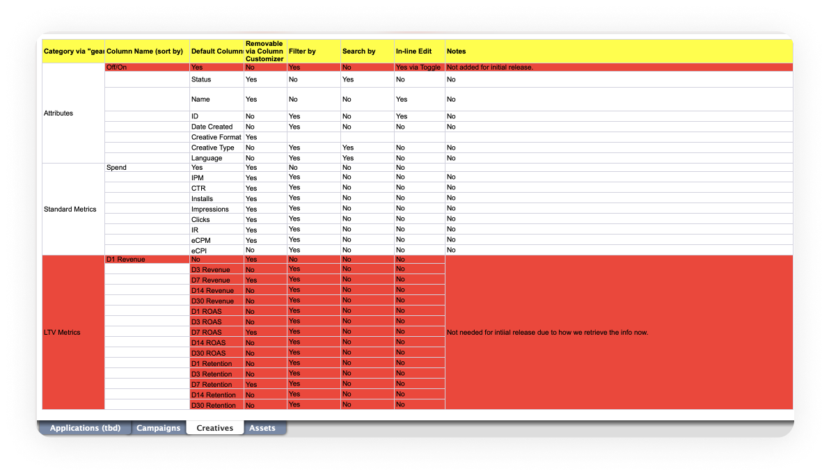
Sheet referencing sortable, filterable, searchable, default and removable columns in the Creative list data table.
An asset filter was implemented to enable users to sort by Video, Image, or Playable Asset type. The assets are categorized by type, and both Asset name and ID are searchable for ease of access.
Expanded rows display the composition of assets within a creative. The image on the right illustrates the diverse complexity of various creatives, ranging from banners to MREC and full-screen formats.
an alternative perspective for the Creative view, enabling users to see the asset composition in a grid format upfront.
The decision was made to defer the implementation of this feature enhancement until After Phase 3.

Overall Insights After Release
Insights from the New Reports Page:
The overhauled Reports page experienced a 30% increase in user engagement, with users spending more time exploring and analyzing their campaign performance data.
Enhanced filters and a streamlined table structure reduced the average time spent on generating custom reports by 40%, resulting in greater efficiency.
User feedback indicated high satisfaction with the improved user experience, especially regarding the intuitive navigation and quick access to key metrics.
Campaigns List Enhancements:
The upgraded Campaigns list led to a 25% decrease in the time it took users to locate and manage their active campaigns.
Users praised the consolidated data view that seamlessly integrated attributes, resulting in a 20% reduction in errors associated with data entry and management.
The introduction of sortable and filterable columns empowered users to make quicker decisions when optimizing their campaign strategies.
Revitalized Creative List Insights:
The newly enhanced Creative list received positive feedback for its intuitive accordion view that provided a comprehensive overview of each Creative's assets.
Users reported a 15% increase in efficiency when assigning and managing assets to their creatives due to the improved organization and asset search functionality.
The searchable asset names and IDs resolved the previous challenges of identifying specific assets, resulting in a 35% reduction in user frustration and errors.
